| Oracle® WebCenter Content Application Administrator's Guide for Content Server 11g Release 1 (11.1.1) Part Number E10978-02 |
|
|
PDF · Mobi · ePub |
| Oracle® WebCenter Content Application Administrator's Guide for Content Server 11g Release 1 (11.1.1) Part Number E10978-02 |
|
|
PDF · Mobi · ePub |
This appendix provides information about the user interface screens for administration applications including window and menu elements and options.
This section provides information about the interfaces used with the repository and contains the following topics:
Consumers and contributors access Oracle WebCenter Content Server from a standard Web browser. The computer you use to access the content server is a client computer. You can access Oracle WebCenter Content Server on a supported client computer from the following supported Web browsers:
Note:
If you are using Firefox, set Firefox to open links in a new window instead of a new tab. In some cases, help screens opened in a new tab are not viewable until the applet that launched the help closes. Opening the help in a separate window makes it viewable while the applet that launched the help runs.
This screen is an administration application used to manage content types, file formats, and custom metadata fields.
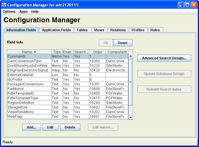
To access this page, log on as an administrator or subadministrator, and choose Administration then Admin Applets from the Main menu. Click Configuration Manager.
Note:
Only administrators can work with Configuration Manager. Subadministrators do not have access to this application.
| Element | Description |
|---|---|
|
Options menu |
Opens additional administrative applications to manage information fields and file format. |
|
Apps menu |
Provides options for other administration applications which open in the same mode (applet or standalone) as the current application. |
|
Information Fields |
Opens the Configuration Manager: Information Field Tab Screen. |
|
Application Fields |
Opens the Configuration Manager: Application Fields Tab Screen. |
|
Tables |
Opens the Configuration Manager: Tables Tab Screen. |
|
Views |
Opens the Configuration Manager: Views Tab Screen. |
|
Relations |
Opens the Configuration Manager: Relations Tab. |
|
Profiles |
Opens the Configuration Manager: Profiles Tab Screen. |
|
Rules |
Opens the Configuration Manager: Rules Tab Screen. |
Multi-Use Screens
The following screens are used in many administration applications for a variety of detailed purposes:
This screen is used to select content for previewing.
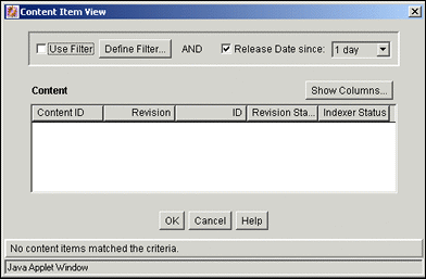
You can access this screen from different locations in the user interface.
| Element | Description |
|---|---|
|
Use Filter |
Narrows the list of content items included in the Content pane. If selected, enables filtering based on selected fields, defined filter fields or release date, if specified. |
|
Define Filter |
Opens the Define Filter Screen. |
|
Release Date since and date list |
If selected, enables filtering based on release date since the specified elapsed time period of 1 day, 1 week, or 4 weeks. |
|
Show Columns |
Opens the Show Columns Screen. |
|
Content pane |
Displays the values of the selected display columns for each content item included in the Content items list. |
This screen is used to select users to include when previewing profile scenarios.
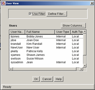
You can access this screen from different locations in the user interface.
| Element | Description |
|---|---|
|
Use Filter |
Narrows the list of users. |
|
Define Filter |
Opens the Define Filter Screen. |
|
Show Columns |
Opens the Show Columns Screen. |
|
Users pane |
Displays the values of the selected display columns for each user included in the Users list. |
This screen is used to narrow the list of revisions, users, and so forth that are displayed on several administration application screens. The items displayed are filtered based on the criteria entered. You can use the following wildcards in these fields:
percent (%) for one or more characters
underscore (_) for a single character
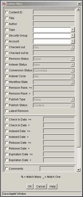
To access this screen, click Define Filter on the screen. Select one or more check boxes to activate the filter fields.
| Field | Description |
|---|---|
|
check boxes |
If selected, the associated filter expression is applied. |
|
Content ID |
Unique Content ID of the content item. |
|
Title |
Title of the revision. |
|
Author |
User who checked in the revision. |
|
Type |
Content type of the revision. |
|
Security Group |
Security group assigned to the revision. |
|
Account |
Account assigned to the revision. This field is displayed only if accounts are enabled. |
|
Checked out |
Specifies if the revision is checked out. |
|
Checked out by |
User who has the revision checked out. |
|
Status of the revision:
|
|
|
Indexing status of the revision:
Only one revision of any content item can be in Current, Indexing, or Update status at a time. |
|
|
Conversion status of the revision:
|
|
|
Indexer Cycle |
State of the revision in an Indexer cycle:
|
|
Workflow State |
Workflow state of a revision:
|
|
Revision Rank >= and < |
Specifies revision greater than/equal to a specific number or less than a specific number. |
|
Publish Type |
Content type for a revision used with Content Publisher. |
|
Publish Status |
Publishing status of a revision used with Content Publisher:
|
|
Latest Revision |
Display only latest revision of file. |
|
Specified date |
Specifies content that is greater than/equal to a specific date or earlier than a specific date:
|
|
Custom fields |
Any custom metadata fields are also available as filter fields. |
This screen is used to select the columns displayed on some administration screens.

To access this screen, click Show Columns on the screen.
| Element | Description |
|---|---|
|
check boxes |
If selected, the field is displayed. See Section A.1.2.3, "Define Filter Screen" for field descriptions. |
|
Save Settings |
If selected, the column settings are applied every time the Content tab of the Repository Manager or Content Item Subscribed screen is displayed. If unselected, the column settings apply only until the Content tab of the Repository Manager or Content Item Subscribed screen closes. |
The following screens are used when working with Content Types:
This screen is used to add, edit, and delete content types. It is also used to view the name, description, and associated GIF for existing content types and to manage the corresponding images.
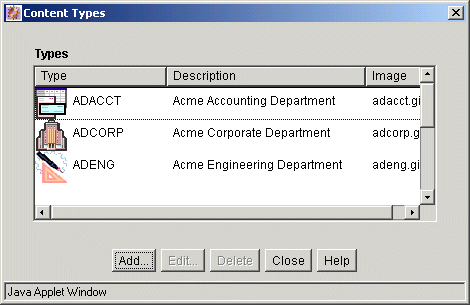
To access this screen, choose Options then Content Types from the Page menu of the Configuration Manager Page.
| Element | Description |
|---|---|
|
Type |
Name of each content type and the GIF image associated with that type. |
|
Description |
Description of each content type. |
|
Image |
File name for the GIF image associated with each content type. |
|
Add |
Opens the Add/Edit Content Type Screen. |
|
Edit |
Opens the Add/Edit Content Type Screen. |
|
Delete |
Enables deletion of the selected content type. You cannot delete a content type if content exists using that type. |
This screen is used to add or edit a content type.
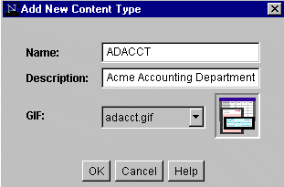
To access this screen, click Add or Edit on the Content Types Screen.
| Element | Description |
|---|---|
|
Name |
Name of the content type. 30 characters maximum. |
|
Description |
Description for the content type. 80 characters maximum. |
|
GIF list |
Image that represents the content type on pages. |
This section covers these screens:
This screen is used to set the file formats and file extensions for file conversions.
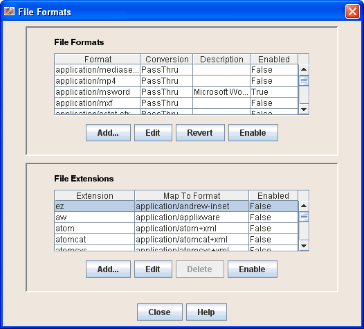
To access this option, choose File Formats from the Options menu on the Configuration Manager Page.
File Formats pane
| Element | Description |
|---|---|
|
Format |
Usually the MIME (Multipurpose Internet Mail Extensions) type. |
|
Conversion |
Method to use to convert the file. |
|
Description |
Description for the file format. |
|
Enabled |
Displays if the format is enabled in the interface. |
|
Add or Edit |
Opens the Add/Edit File Format Screen. |
|
Delete |
Enables deletion of the selected file format. |
|
Enable/Disable |
Enables or disables the selected file format in the interface. |
File Extensions pane
| Element | Description |
|---|---|
|
Extension |
File extensions mapped to file formats. |
|
Map to Format |
File format to be referenced to convert files with that extension. |
|
Enabled |
Displays if the format is enabled in the interface. |
|
Add or Edit |
Opens the Add/Edit File Extension Screen. |
|
Delete |
Enables deletion of the selected file extension. |
|
Enable/Disable |
Enables or disables the selected file format in the interface. |
This screen is used to set conversion methods for specific file formats.
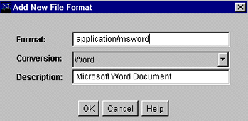
To access this screen, click Add or Edit in the File Formats pane on the File Formats Screen.
| Element | Description |
|---|---|
|
Format |
Usually the MIME (Multipurpose Internet Mail Extensions) type. |
|
Conversion |
Method to use to convert the file. To not convert this file type, choose Passthru. To use a custom conversion method, choose Custom. |
|
Description |
Description for the file format. |
This screen is used to map file extensions to specific file formats.
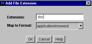
To access this screen, click Add or Edit in the File Extensions pane on the File Formats Screen.
| Element | Description |
|---|---|
|
Extension |
File extension of files to be converted. |
|
Map to Format |
File format to be referenced to convert files with that extension. |
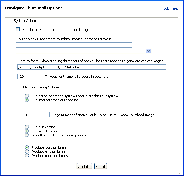
A thumbnail is a small representative image of the associated content item. Use this screen to enable and configure automatic thumbnail generation. To access this screen, choose Configure Thumbnail Options from the Administration tray.
Content Server provides a basic set of thumbnail creation options. Oracle WebCenter Content: Inbound Refinery provides a more extensive set of options for file conversion and thumbnail generation. For more information, see Oracle WebCenter Content Administrator's Guide for Conversion.
| Element | Description |
|---|---|
|
Enable this server to create thumbnail images |
Select to enable thumbnail creation. When enabled, thumbnail images are generated automatically at check in for file types supported by Outside In Image Export and enabled on the File Formats Screen. If the content item has a format which is not supported or which is explicitly excluded, a thumbnail image is not generated and the icon associated with the Document Type (dDocType) is used. If Inbound Refinery is enabled and set up to handle thumbnails, the options you set on this window are not used. |
|
This server will not create thumbnail images for these formats |
Specify a comma-separated list of file formats for which you do not want to generate thumbnails. If you select a format from the list of enabled formats, it is added to the comma-separated list. The list of formats is taken from the enabled formats on the File Formats Screen. |
|
Path to fonts |
Specify the directory that contains the font information used to render characters in the thumbnail. Only TrueType fonts (*.ttf or *.ttc files) are currently supported. In most cases, the fonts provided by the Java environment (<java.home>/lib/fonts/) are adequate. A more extensive selection of TrueType fonts, particularly those with non-western European characters, may be provided by the hosting system. For example, on Linux fonts are located in the /usr/lib/X11/fonts/TTF folder. On Windows, fonts are located in the C:\WINDOWS\Fonts folder. |
|
Timeout for thumbnail process in seconds |
Specify the amount of time in seconds to wait for the thumbnail process to complete. If the thumbnail process does not complete in this time, the process is ended.The default setting is 120 seconds. |
|
UNIX Rendering Options |
For Linux and Solaris SPARC systems, specify rendering options for systems running on UNIX. All other platforms use the internal graphics rendering. Use native operating system's native graphics subsystem: Specify that fonts and graphics are rendered using the operating system's native graphics subsystem (X11 on UNIX platforms). This option works only when at least one of the appropriate output solutions is present. For example, if the UNIX $DISPLAY variable does not point to a valid X Server, but the OSGD and/or WV_GD modules required for internal graphics rendering exist, internal graphics rendering is used. Use internal graphics rendering: Specify that Outside In Image Export will attempt to use its internal graphics code to render fonts and graphics. This is the default option. |
|
Page Number of Native Vault File to Use to Create Thumbnail Image |
For multi-page files, specify the number of the page to use to render the thumbnail. The default page number is 1. |
|
Use quick sizing |
Select for the fastest conversion of color graphics with a somewhat lower quality image. |
|
Use smooth sizing |
Select for a more accurate representation of the original graphic which which will slow down the conversion speed slightly. This is the default setting. |
|
Smooth sizing for grayscale graphics |
Select this option to use smooth sizing for grayscale graphics and quick sizing for any color graphics. |
|
Produce jpg thumbnails radio button |
Select to create all thumbnails as JPG files. This is the default thumbnail file type setting. |
|
Produce gif thumbnails radio button |
Select to create all thumbnails as GIF files. |
|
Produce png thumbnails radio button |
Select to create all thumbnails as PNG files. |
|
Update |
Saves changes to settings. |
|
Reset |
Reverts to the last saved settings. |
The following screens are used to add metadata fields and application fields:
Note:
For information about custom fields for Electronic Signatures, see the Oracle WebCenter Content User's Guide for Content Server.
Section A.1.6.1, "Configuration Manager: Information Field Tab Screen"
Section A.1.6.13, "Configuration Manager: Application Fields Tab Screen"
This screen is used to add, edit, and delete custom metadata fields.

To access this screen, click Information Fields on the Configuration Manager Page.
| Element | Description |
|---|---|
|
Name |
Names of custom metadata fields. |
|
Type |
Type for each field. Values include:
|
|
Enabled |
Indicates if the field is displayed on Oracle WebCenter Content Server pages. |
|
Searchable |
Indicates if the field is indexed and available for searches. |
|
Order |
Indicates the place the field occupies in the sort order. |
|
Up and Down |
Rearranges the order of fields for sorting. To use, highlight a field and click the appropriate button. The field's position in the sort order is changed accordingly. |
|
Advanced Search Design |
Saves changes to the database tables. This button is active when an update is required. |
|
Update Database Design |
Saves changes to the database tables. This button is active when an update is required. |
|
Rebuild Search Index |
Rebuilds the search index. This button is active when a rebuild is required. |
|
Add or Edit |
Opens the Add Metadata Field Name Screen. |
|
Delete |
Enables deletion of the selected custom metadata field. |
|
Edit Values |
Displays a parent/child structure if a field is associated with a schema relationship. This option is active after the field is added and the database design is updated. |
This dialog is used to define the name of a new custom metadata field.

To access this dialog, click Add on the Configuration Manager: Information Field Tab Screen.
When adding a custom metadata field, the system automatically prefixes the name with an x to ensure that it is unique and does not conflict with any reserved names. Similarly, when a custom user information (metadata) field is defined, the system automatically prefixes the name with a u to ensure that it is also unique and does not conflict with any reserved names.
| Element | Description |
|---|---|
|
Field Name |
Duplicate names are not allowed. Maximum field length is 29 characters. Use only letters, numbers, and underscores (_). Do not use special characters. |
This screen is used to define a custom metadata field.
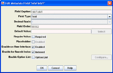
To access this screen, do one of the following:
Enter a field name and click OK on the Add Metadata Field Name Screen.
Select a field and click Edit on the Configuration Manager: Information Field Tab Screen.
| Element | Description |
|---|---|
|
Field Caption |
Display label shown on Oracle WebCenter Content Server pages. |
|
Field Type |
Type for each field. Values include:
|
|
Decimal Scale |
Specifies the supported number of digits to the right of the decimal. This field is supported for fields with a Field Type of Decimal only. |
|
Field Order |
Sequence in which the field is displayed on pages. Starting at 2, the number automatically increments as new fields are added. |
|
Default Value |
Default value for the field. |
|
Require Value |
If selected, prevents files from being checked in if the field does not contain a value. |
|
Placeholder |
If selected, makes this a field which is not stored or indexed. Placeholders are often used for the parent level of a dependent choice list. |
|
Enable on User Interface |
If selected, the field is displayed on pages. |
|
Enable for Search Index |
If selected, the field is indexed and can be used as search criteria. |
|
Enable Option List |
If selected, creates a user-selectable list on pages. |
This screen is used to specify the type of list, the values for the list and any dependencies associated with the list.
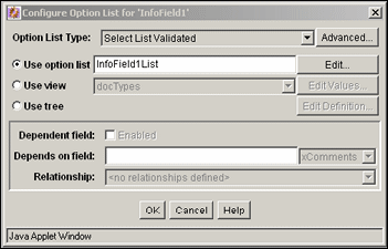
To access this screen, click Enable Option List then click Configure on the Add Metadata Field Name Screen or the Add/Edit Metadata Field Screen.
| Element | Description |
|---|---|
|
Option List Type |
|
|
Advanced |
Opens the Option List Storage Screen. |
|
Use option list |
Creates a new list. The name of the new list is inserted into the field. |
|
Edit |
Opens the Option List Screen. |
|
Use view |
Used to choose values in a view instead of a created list. |
|
Edit Values |
Opens the Edit View Values Screen or the Option List Screen, depending on the type of view selected. |
|
Use tree |
Used to choose values in a tree, not a list or a view. |
|
Edit Definition |
Opens the Option List Screen. |
|
Dependent field |
If selected, enables a dependency to make the metadata field subordinate to another metadata field. Available when using a view. |
|
Depends on field |
Used to enter a field name or choose from a list of metadata to use to set dependencies. |
|
Relationship |
Lists previously defined view relationships. If none are defined, an appropriate message is displayed. |
This screen is used to specify how the list is displayed and stored.
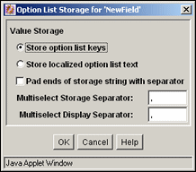
To access this screen, click Advanced next to the list on the Configure Option List Screen.
| Element | Description |
|---|---|
|
Store option list keys |
Permanently stores option list keys or localized option list text. |
|
Store localized option list text |
Stores localized versions of the list or localized list text. |
|
Pad ends of storage string with separator |
Active only if a Multiselect option is chosen on the Configure Option List Screen. Pads the length of the separator that stores multiselect values. |
|
Multiselect Storage Separator |
Active only if a Multiselect option is chosen on the Configure Option List Screen. Changes the separator that stores multiselect values. |
|
Multiselect Display Separator |
Active only if a Multiselect option is chosen on the Configure Option List Screen. Change the separator that displays multiselect values. |
This screen is used to edit the values defined in a view.
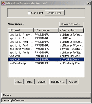
To access this screen, click Edit Value next to Use View on the Add/Edit Metadata Field Screen. The columns depend on the type of view selected.
| Element | Description |
|---|---|
|
Use Filter |
If selected, applies the filter defined by the Define Filter Screen. |
|
Define Filter |
Opens the Define Filter Screen |
|
Show Columns |
Limits the number of columns to show in the view. |
|
Add or Edit |
Opens the Add/Edit Value Screen. |
|
Delete |
Enables deletion of a value from the table. |
|
Edit Batch |
Opens the Edit Values: Edit Batch screen. |
This screen is used to create a list for a custom field.
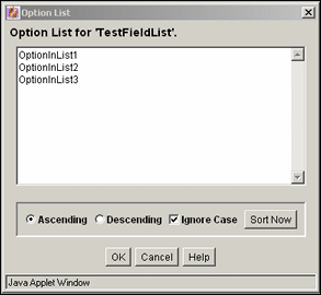
To access this screen, click Edit next to Use Option List on the Configure Option List Screen.
| Element | Description |
|---|---|
|
Option list pane |
Used to enter the values available for the custom metadata field. Each value must be on a separate line, with a carriage return between values. |
|
Ascending or Descending |
Sorts the list in alphanumeric order or reverse alphanumeric order, with capital letters preceding lower-case letters. For example, an Ascending list with Ignore Case disabled lists ABCDF before abcde. |
|
Ignore Case |
Ignores uppercase or lowercase when sorting items. |
|
Sort Now |
Sorts the list in the manner specified. |
This screen is used to define how a tree used in a list is stored and displayed.
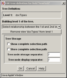
To access this screen, click Edit Definition next to Use Tree on the Configure Option List Screen.
| Element | Description |
|---|---|
|
Select relationship menu |
Used to select a relationship between levels of the list. |
|
Remove view |
If selected, removes the selected view. |
|
Show complete selection path |
If selected, displays the complete path when the option is selected. |
|
Store complete selection path |
If selected, saves the complete path when the option is selected. |
|
Tree node storage separator |
Used to store a different operator between values. |
|
Tree node display separator |
Used to change the separator between values. |
This screen allows selection of parent values when browsing for a child in a dependent choice list (DCL) schema. You can choose a row in a table that is the root of the tree.
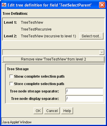
This screen opens at different locations in the user interface.
| Element | Description |
|---|---|
|
Tree Definition pane |
Displays the tree schema hierarchy. |
|
Select Root |
Opens a popup dialog to select parent values for a child value. |
|
Other screen elements |
For descriptions of the other screen elements see Section A.1.6.8, "Edit Tree Definition Screen." |
Use this screen to select and edit fields for which you can modify the search optimization and sort options.
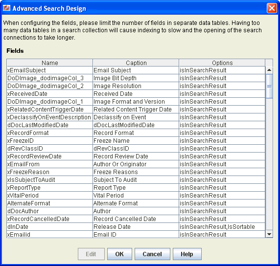
To access this screen, click Advanced Search Design on the Configuration Manager: Information Field Tab Screen.
| Element | Description |
|---|---|
|
Name |
Displays the internal name of the field. |
|
Caption |
Displays the display name of the field. |
|
Options |
Displays the current set of search options for the field. |
|
Edit |
Opens the Advanced Options for Field Screen to specify search options for the selected field. |
Use this screen to configure optimization and sort options for searchable fields. WebCenter Content uses the SDATA section feature in Oracle Text 11g to index important text, date, and integer fields and define them as Optimized Fields. The SDATA section is a separate XML structure managed by the Oracle Text engine that allows the engine to respond rapidly to requests involving data and integer ranges. The Content Server system can have up to 32 Optimized Fields, which includes data, integer, standard Content Server fields like dInDate, dOutDate, and fields selected to be optimized. All Optimized Fields are SDATA fields, which by default include dDocName and dDocTitle.
Note:
Specify only text, date, and integer fields as optimized fields. Memo, fields, for example cannot be optimized for search.
Any changes made on this screen require you to rebuild the search index.
Caution:
Depending on the size of the search index and available system resources, the search index rebuild process can take several days. If rebuilding is necessary, rebuild at times of non-peak system usage.
To access this screen, add or delete a custom metadata field and click Advanced Search Design on the Configuration Manager: Information Field Tab Screen.
| Element | Description |
|---|---|
|
Is returned in the search results |
This value is specified on the Add/Edit Metadata Field Screen and cannot be modified here. |
|
Is optimized |
Selects the field for optimization. By default, the dDocName (Content ID) and dDocTitle (Title) fields are optimized. |
|
Is sortable |
Selects the field for sorting on the search results page. You must first select Is optimized to select this option. Sortable fields on the search results page become a link in column header. An arrow icon next to the field name indicates ascending or descending order. By default, dInDate (Release Date) and dDocTitle (Title) are sortable. |
|
Is a filter category |
Selects the field to show in the set of Filter by Category options listed at the top of the search results page. |
This screen is used to add or delete metadata fields in the Oracle WebCenter Content Server database. The following table lists the events after which a database update or search index rebuild is required depending on the search engine.
| Event | Action Required |
|---|---|
|
Add metadata field |
Update database |
|
Edit metadata field |
Update database* |
|
Delete metadata field |
Update database |
|
Enable or disable Enable for Search Index for metadata field |
Rebuild search index |
|
Add metadata field with Enable for Search Index selected |
Rebuild search index |
Changes to the Require Value, Option List Default Value, Option List Key, and Option List values do not require a database update.
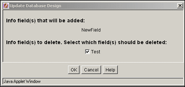
To access this screen, add or delete a custom metadata field and click Update Database Design on the Configuration Manager: Information Field Tab Screen.
| Element | Description |
|---|---|
|
Info field(s) that will be added |
Lists the metadata fields added since the last time the database was updated. |
|
Info field(s) to delete check boxes |
Lists the metadata fields that were deleted since the last time the database was updated. If selected, the field is deleted from the database. If unselected, the field remains hidden on the Configuration Manager screen and check-in and search pages, but it still exists in the database. |
This screen is used to add, edit, and delete custom fields used on Oracle WebCenter Content Server forms.
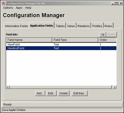
To access this screen, click Application Fields on the Configuration Manager Page.
| Element | Description |
|---|---|
|
Field Name |
The names of custom application fields. |
|
Field Type |
The type for each field. |
|
Order |
The place the field occupies in the sort order. |
|
Up or Down |
Rearrange the order of fields for sorting. To use, highlight a field and click the appropriate button. The field's position in the sort order is changed accordingly. |
|
Add or Edit |
Opens the Add/Edit Metadata Field Screen. |
|
Delete |
Deletes the selected custom metadata field. |
|
Edit Tree |
Displays a parent/child structure if a field is associated with a schema relationship. This option is active after the field is added and the database design is updated. |
This screen is used to add the necessary information for a custom application field.
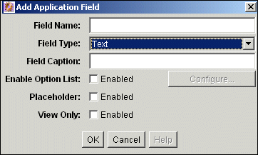
To access this screen, click Add or highlight a field and click Edit on the Configuration Manager: Application Fields Tab Screen.
| Element | Description |
|---|---|
|
Field Name |
Name of the field. Duplicate names are not allowed. Maximum field length is 29 characters. Do not use special characters. |
|
Field Type |
Type for each field. Values include:
|
|
Field Caption |
Display label shown on pages. |
|
Enable Option List |
Creates a user-selectable list on pages. |
|
Placeholder |
If selected, makes this a field which is not stored or indexed. Placeholders are often used for the parent level of a dependent choice list. |
|
View Only |
If selected, makes this a field used only in a schema view. |
Use the Electronic Signatures Configuration screen to define additional metadata fields that are stored as part of the metadata for the electronic signature. Electronic signature information is stored and managed in a separate ElectronicSignatures table in the database.
Note:
Plan your custom fields carefully before you use them. After you create a field (click Save Changes), you cannot change the field name, the data type, or the required status. If you delete a field, you delete any data previously stored in that field.

| Element | Description |
|---|---|
|
Add Field icon |
Add a row to the table to define a new custom field. |
|
Delete Field icon |
Delete selected fields from the database. Fields are deleted permanently when you click Save Changes. When you delete a field, you delete any data previously stored in that field. |
|
Move Field Up icon |
Move the selected field up one position in the table order. The order of fields in the table determines the order of fields presented on the Sign Content Item page. |
|
Move Field Down icon |
Move the selected field down one position in the table order. The order of fields in the table determines the order of fields presented on the Sign Content Item page. |
|
Select/Deselect Items |
Select one or more items to move or delete. Click one time to select and individual item. Click again to deselect an item. Click the check box at the top of the column to select/deselect all field rows in the table at one time. |
|
Name |
Specify the internal identifier of the field. Maximum field name length is 29 characters. Use only letters, numbers, and underscores (_). Do not use spaces or other special characters. The name must begin with a letter. |
|
Display Label |
Specify the name displayed to users. For check box fields, Display Label contains the text to display next to the check box. |
|
Data Type |
Select a data type from the list of supported types. When users enter a value in the field, it is validated against the selected data type:
|
|
Use Choice List |
Select the check box to specify a list of values from which the user can choose. Choice lists are available only for text and integer data types. |
|
Choice List |
Specify a list of values from which the user can choose. Separate values with a comma. The values you specify must conform to the data type guidelines listed above. Values are presented in the order listed. The first value in the list is the default value for the field. To provide no default value, enter a space followed by a comma as the first value in the choice list. |
|
Checkbox |
Select the check box to specify that the custom field is itself a check box. A check box field is automatically designated a required field. The user must select the check box to complete the electronic signature.The Display Label field contains acknowledgement text to display next to the check box. |
|
Required |
Specify that the user must supply a value in the associated field to complete the electronic signature. |
|
Save Changes |
Permanently save any changes made since the last save operation. After you create and save a field, you cannot change the field name, the data type, or the required status. If you delete a field, you delete any data previously stored in that field. |
|
Reset |
Discard any changes made since the last save operation. |
The following screens are used to access the Repository Manager:
This screen shows the options and tabs available with the Repository Manager.
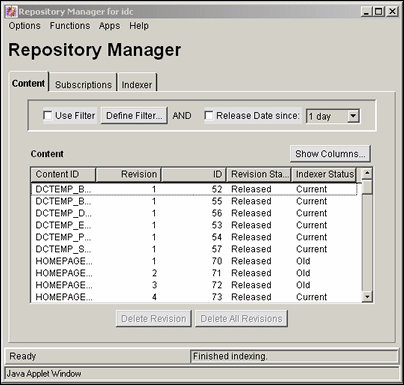
To access this screen, choose Administration then Admin Applets from the Main menu. Click Repository Manager. You can also start Repository Manager in standalone mode.
| Element | Description |
|---|---|
|
Options menu |
Displays options to start tracing or to exit the Repository Manager. |
|
Functions menu |
Displays options to update content, check out content, reject content, and perform other content related actions. All options are also available from a shortcut menu, accessed when you right-click a revision in the Content list. |
|
Apps menu |
Displays other administration applications. The other applications open in the same mode (applet or standalone) as the current application. |
|
Content |
Opens the Repository Manager: Content Tab Screen. |
|
Subscriptions |
Opens the Repository Manager: Subscriptions Tab Screen. |
|
Indexer |
See the Oracle WebCenter Content System Administrator's Guide for Content Server for details about indexing functions. |
This screen is used to display content item revisions.

To access this screen, click Content on the Repository Manager Main Screen.
| Element | Description |
|---|---|
|
Use Filter |
If selected, applies the filter defined by the Define Filter Screen. |
|
Define Filter |
Opens the Define Filter Screen |
|
Release Date since |
If selected, narrows the Content list as defined by the Release Date list. |
|
Show Columns |
Opens the Show Columns Screen. |
|
Content list |
Shows the revisions in the repository that match the filter settings. |
|
Add New |
Opens the Add New Content Item Screen. Only available in the standalone Repository Manager application. |
|
Add Revision |
Opens the Add New Revision Screen. Only available in the standalone Repository Manager application. |
|
Delete Revision |
Opens the Delete Revision Screen. |
|
Delete All Revisions |
Opens the Delete All Revisions Screen. |
The following screens are used to manage content:
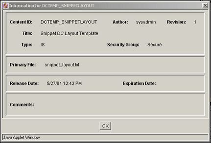
This screen is used to view the metadata for a revision.
To access this screen, do one of the following:
Select a revision on the Repository Manager: Content Tab Screen then choose Functions then Info.
Right-click a revision on the Repository Manager: Content Tab Screen and choose Info.
Standard metadata fields and custom metadata fields are displayed.
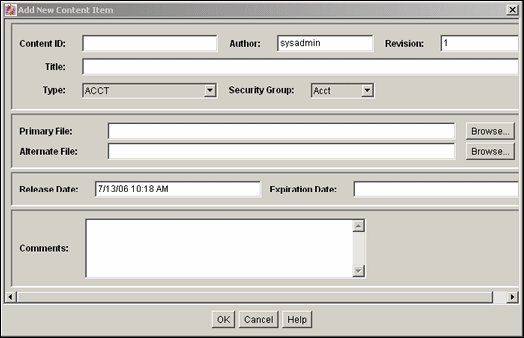
This screen is used to check a new content item into the system without using an Oracle WebCenter Content Server check-in page.
To access this screen, click Add New on the standalone Repository Manager: Content Tab Screen. Standard metadata fields and custom metadata fields are displayed.
This screen is used to change the metadata of an existing revision. To access this screen, do one of the following:
Select a revision on the Repository Manager: Content Tab Screen and choose Functions then Update from the Page menu.
Right-click a revision on the Repository Manager: Content Tab Screen and choose Update from the menu.
Standard metadata fields and custom metadata fields are displayed.
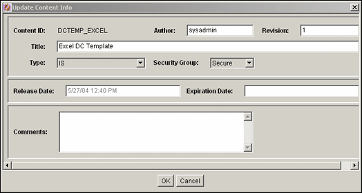
The following screens are used when working with revisions:
This screen is used to check in a revision of an existing content item.
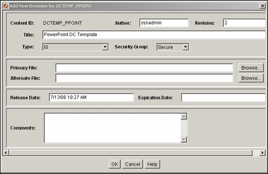
To access this screen, do one of the following on the standalone Repository Manager Main Screen:
Select a revision then click Add Revision.
Select a revision and choose Functions then Add Revision from the Page menu.
Right-click a revision and choose Add Revision from the menu.
Standard metadata fields and custom metadata fields are displayed.
This screen is used to check out revisions.
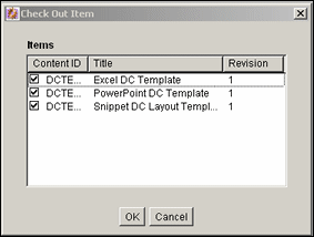
To access this screen, select one or more revisions on the Repository Manager: Content Tab Screen and do one of the following:
Choose Functions then Check Out from the Page menu.
Right-click and choose Check Out from the menu.
| Element | Description |
|---|---|
|
check boxes |
If selected, the revision is checked out. |
This screen is used to undo a checkout.
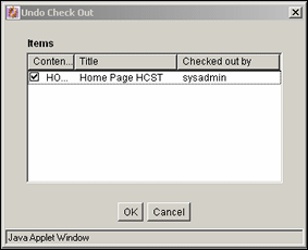
To access this screen, select one or more revisions on the Repository Manager: Content Tab Screen, and do one of the following:
Choose Functions then Undo Check Out from the Page menu.
Right-click and choose Undo Check Out from the menu.
| Element | Description |
|---|---|
|
check boxes |
If selected, the checkout is reversed for the revision. |
This screen is used to submit a file to Inbound Refinery for conversion.
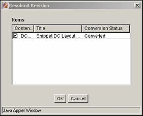
To access this screen, select one or more revisions on the Repository Manager: Content Tab Screen and do one of the following:
Choose Functions then Resubmit from the Page menu.
Right-click and choose Resubmit from the menu.
Note:
You cannot resubmit files in the Inbound Refinery queue.
| Element | Description |
|---|---|
|
check boxes |
If selected, the revision is resubmitted to Inbound Refinery. |
This screen is used to delete individual revisions.
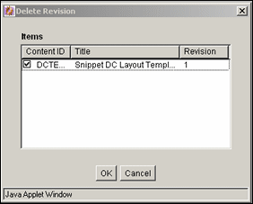
To access this screen, select one or more revisions on the Repository Manager: Content Tab Screen and do one of the following:
Click Delete Revision.
Choose Functions then Delete Revision from the Page menu.
Right-click then choose Delete Revision from the menu.
| Element | Description |
|---|---|
|
check boxes |
If selected, the revision is deleted. |
This screen is used to delete all revisions of selected content items.
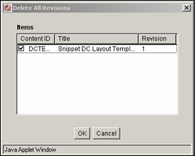
To access this screen, select one or more revisions on the Repository Manager: Content Tab Screen and do one of the following:
Click Delete All Revisions.
Choose Functions then Delete All Revisions from the Page menu.
Right-click then select Delete All Revisions from the menu.
| Element | Description |
|---|---|
|
check boxes |
If selected, all revisions of the content item are deleted. |
The following screens are used when handling workflows:
This screen is used to approve revisions in a workflow.
Note:
Only revisions in a workflow are displayed on this screen.
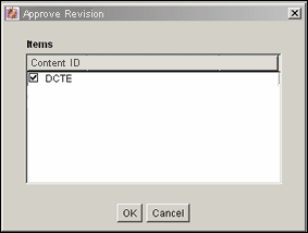
To access this screen, select one or more revisions in a workflow on the Repository Manager: Content Tab Screen and do one of the following:
Choose Functions then Approve from the Page menu.
Right-click and select Approve from the menu.
| Element | Description |
|---|---|
|
check boxes |
If selected, the revision is approved. |
This screen is used to reject revisions in a workflow. Only the revisions in a workflow are displayed on this screen.
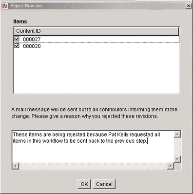
To access this screen, select one or more revisions on the Repository Manager: Content Tab Screen and do one of the following:
Choose Functions then Reject from the Page menu.
Right-click and select Reject from the menu.
| Element | Description |
|---|---|
|
check boxes |
If selected, the revision is rejected. |
|
Rejection message |
Message to be sent for all rejected revisions. |
The following screens are used when managing subscriptions:
This screen is used to create and edit Criteria subscriptions.
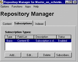
To access this screen, click Subscriptions on the Repository Manager Main Screen.
| Element | Description |
|---|---|
|
Type |
Name of the subscription. |
|
Field List |
Active criteria fields assigned to the subscription. |
|
Description |
Description of the subscription. |
|
Status |
Status, either enabled or disabled, for the subscription. |
|
Add or Edit |
Opens the Add/Edit Subscription Type Screen. |
|
Delete |
Removes the subscription from the list. |
|
Subscribers |
Opens the Users Subscribed Screen. |
This screen is used to add or edit a subscription.
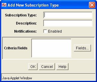
To access this screen, click Add or Edit on the Repository Manager: Subscriptions Tab Screen.
| Element | Definition |
|---|---|
|
Subscription Type |
Name given to the subscription. |
|
Description |
Description of the subscription. |
|
Notifications |
If selected, e-mail messages are sent to subscribers when content meeting the subscription criteria is checked in or updated. |
|
Criteria Fields pane |
The metadata fields used to define the subscription. |
|
Fields |
Opens the Fields Screen. |
This screen is used to define the metadata fields for a subscription.
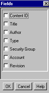
To access this screen, click Fields on the Add/Edit Subscription Type Screen.
| Element | Definition |
|---|---|
|
check boxes |
If selected, the field is included in the subscription criteria. |
This screen is used to view, add, and delete specific users and aliases for a subscription and to view the content items that meet the subscription criteria.
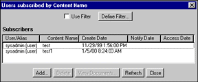
To access this screen, select a subscription and click Subscribers on the Repository Manager: Subscriptions Tab Screen.
| Element | Description |
|---|---|
|
Use Filter |
If selected, filters the list as defined by the Define Subscription Filter Screen. |
|
Define Filter |
Opens the Define Subscription Filter Screen. |
|
Subscribers information |
Subscribed users and aliases that match the filter settings. Information includes the name of the subscribed content, the date the user was added to the subscription, the last date the user was notified about a revision to the subscribed content, and the last date the user accessed the file defined by the subscription criteria. Note that the access date is not recorded for an alias. |
|
Add |
Opens the Add Subscription Screen. |
|
Delete |
Deletes the user or alias from the subscription. |
|
View Content Items |
Opens the Content Item Subscribed Screen. |
|
Refresh |
Refreshes the screen with the most current data. |
This screen is used to narrow the list of users and aliases displayed on the Users Subscribed screen.
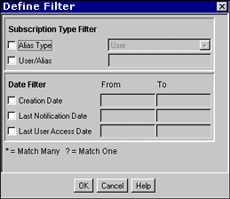
To access this screen, click Define Filter on the Users Subscribed Screen. The Users Subscribed Screen is filtered based on the criteria entered. You can use the following wildcards in these fields:
When using MS Access, or MSDE:
asterisk (*) for one or more characters
question mark (?) for a single character
With other databases:
percent (%) for one or more characters
underscore (_) for a single character
| Element | Description |
|---|---|
|
Alias Type |
If User is selected, only users are shown. If Alias is selected, only aliases are shown. |
|
User/Alias |
Specific user or alias name. |
|
Creation Date |
Date the user or alias was added to the subscription (regardless of enabled/disabled status). |
|
Last Notification Date |
Last date the user was notified about a revision to the subscribed content. |
|
Last User Access Date |
Last date the user accessed the file defined by the subscription. |
This screen is used to view content items that match the criteria for a subscription.
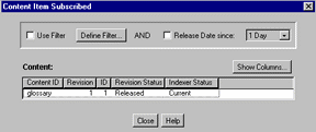
To access this screen, click View Content Items on the Users Subscribed Screen.
| Element | Description |
|---|---|
|
Use Filter |
If selected, applies the filter defined by the Define Filter Screen. |
|
Define Filter |
Opens the Define Filter Screen |
|
Release Date since |
If selected, narrows the Content list as defined by the Release Date list. |
|
Show Columns |
Opens the Show Columns Screen. |
|
Content list |
Shows the subscribed revisions matching the filter settings with a maximum of 50 revisions per page. Double-click a revision to open the Information Screen for that revision. For more details, see Section A.1.2.3, "Define Filter Screen." |
This screen is used to add a specific subscription for a user or alias.
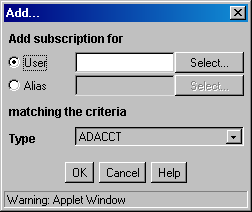
To access this screen, click Add on the Users Subscribed Screen.
| Element | Description |
|---|---|
|
User or Alias |
User or alias to be added to the subscription. Click Select to open the Select User Screen or Select Alias Screen. |
|
Criteria fields |
Metadata values subscribed to the selected user or alias. All criteria fields specified for the subscription are displayed. |
This screen is used to select a user to assign to a subscription.
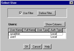
To access this screen, select the User option and click Select on the Add Subscription Screen.
| Element | Description |
|---|---|
|
Use Filter |
If selected, narrows the users list as defined by the Define Filter Screen. |
|
Define Filter |
Opens the Define Filter Screen. |
|
Show Columns |
Opens the Show Columns Screen. |
|
Users list |
Users matching the filter settings. |
This screen is used to select an alias to assign to a subscription.
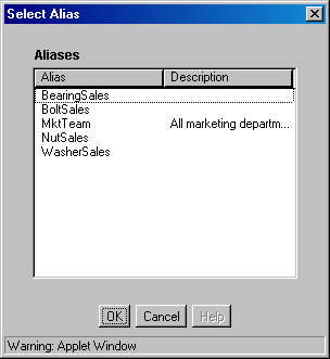
To access this screen, select the Alias option and click Select on the Add Subscription Screen.
| Element | Description |
|---|---|
|
Alias |
The available aliases. |
|
Description |
Description of the alias. |
This screen is used to view and unsubscribe users from subscriptions to a specific revision.
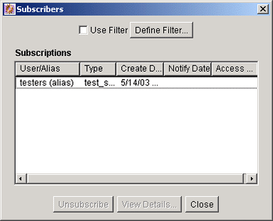
To access this screen, select a revision on the Repository Manager: Content Tab Screen and do one of the following:
Select Functions then Subscribers from the Page menu.
Right-click and select Subscribers from the menu.
See the Users Subscribed Screen for a description of the fields on this screen.
Use the Managed Links Administration Page to update the ManagedLinks and LinkReferenceCount tables.
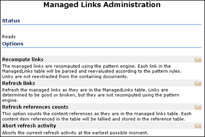
To access this screen, choose Administration then Managed Links Administration from the Main menu. Click Go next to any option to perform the action.
| Element | Description |
|---|---|
|
Status |
An indication of activity. If idle, the status is 'Ready'. Otherwise, an indication of the type of refresh being performed, how many links have been processed, and how many errors have been encountered is displayed. Refreshing the page (for example, by pressing F5), refreshes the status message. |
|
Recompute links |
Resubmits links to the patterns engine. Use this option if the pattern rules have changed. |
|
Refresh links option |
Checks each link in the ManagedLinks table and attempts to determine if the link is valid. Site Studio links are sent to the Site Studio decode method to determine what nodes and content items are used by the link. Use this option if substantial changes were made to Site Studio node/section properties. |
|
Refresh references counts option |
Flushes the LinkReferenceCount table and queries the ManagedLinks table for the content item references |
|
Abort refresh activity option |
Aborts the current refresh activity. |
The following screens are used to create a schema:
Important:
You can use core Oracle WebCenter Content Server system tables such as Revisions, Alias, Documents, and Users, but you cannot edit the tables themselves.
This screen is used to create or edit tables and columns used in schemas. If existing tables are not used when establishing views and relationships, an external tool must be used to generate records and populate the tables created using the Tables tab.
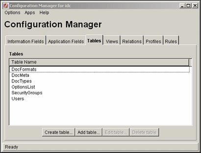
To access this screen, click Tables on the Configuration Manager Page.
| Element | Description |
|---|---|
|
Table Name |
Lists the existing tables. |
|
Create table |
Opens the Create/Edit Table 'name' Screen. |
|
Add table |
Opens the Select Table Screen. |
|
Edit table |
Opens the Create/Edit Table 'name' Screen. |
|
Delete table |
Enables deletion of the selected table. |
This screen is used to indicate which tables are used in the schema.
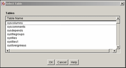
To access this screen, click AddtTable on the Configuration Manager: Tables Tab Screen or Add table on the Add View Screen: Select Table Screen.
| Element | Description |
|---|---|
|
Table Name list |
Lists the existing database tables from the list. |
This screen is used to specify the columns for tables to be used in a schema.
Important:
You can use Core Oracle WebCenter Content Server system tables such as Revisions, Alias, Documents, and Users but you cannot edit the tables themselves.
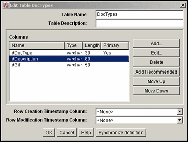
To access this screen, click Create Table or Edit Table on the Configuration Manager: Tables Tab Screen or click Create Table on the Add View Screen: Select Table Screen.
| Element | Description |
|---|---|
|
Table Name |
Name of the table to be created or edited. |
|
Table Description |
Description of the table to be created of edited. |
|
Columns |
Columns and their properties included in this table. |
|
Add or Edit |
Opens the Add/Edit Column Screen. |
|
Delete |
Enables deletion of the selected column. |
|
Add Recommended |
Adds standard columns to the table such as schPrimaryKey, schCreateTimestamp, and so on. |
|
Row Creation and Row Modification Timestamp Column |
Field indicating the time when a row in the table is created or modified. This column must be added to ensure the table replication functions properly. |
|
Synchronize definition |
Loads the definition of the table from the database and synchronizes it with the one currently in view. Useful when two people are manipulating the table simultaneously and a warning is issued, indicating that the copy of the table is outdated. Synchronizing the definition updates the table. |
This screen is used to select the column to be the primary key in the schema.
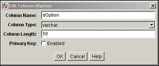
To access this screen, select a column from the Create/Edit Table 'name' Screen and click Edit or click Add to create a column.
| Element | Description |
|---|---|
|
Column Name |
Name of the column to be created or edited. To avoid potential conflicts with Oracle WebCenter Content Server database tables, always add a prefix to column names such as schColumnOne. |
|
Column Type |
Column type. Default: varchar. |
|
Column Length |
Length of the value to store in the column. |
|
Primary Key |
If selected, the column is designated as a primary key for the table. |
This screen is used to create the views used with the schemas.
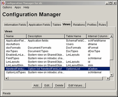
To access this screen, click Views on the Configuration Manager Page.
| Element | Description |
|---|---|
|
Views |
Lists the existing views and related information. |
|
Add |
Opens the Add View Screen: Select Table Screen. |
|
Edit |
Opens the Add/Edit View Screen. |
|
Delete |
Enables deletion of the selected view. |
|
Edit Values |
Opens a screen such as the Add/Edit Value Screen or the Option List Screen used to add or change values in the table associated with the view. The screen depends on the type of table used for the view. |
This screen is used to create a view for a schema.
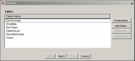
To access this screen, click Add on the Add View Screen: Select Table Screen.
| Element | Description |
|---|---|
|
Table Name |
Lists the tables created that do not have a view. |
|
Create table |
Opens the Create/Edit Table 'name' Screen. |
|
Add table |
Opens the Select Table Screen. |
|
Edit table |
Opens the Create/Edit Table 'name' Screen. |
|
Delete table |
Enables deletion of the selected table in this schema. |
This screen is used to choose the columns for the schema view.
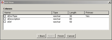
To access this screen, select a table from the Add View Screen: Select Table Screen and click Next.
| Element | Description |
|---|---|
|
Name list |
Names of the existing table columns that you can include in the view and publish to a schema. |
The Add View screen has four main tabs used when adding views.
Add/Edit View Screen: Info Tab
This screen is used to name the new view for the schema.
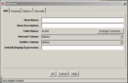
This screen opens after you choose the columns to use for the view on the Add View Screen: Select Columns Screen page and click Finish or if a view is selected to edit on the Configuration Manager: Views Tab Screen.
| Element | Description |
|---|---|
|
View Name |
Name of the view to be created or edited. |
|
View Description |
Description of the view to be created. |
|
Table Name |
The table associated with this view. Click Change Columns to open a screen to select a column. |
|
Internal Column list |
Column name in the view being created (used internally). |
|
Visible Column list |
Column name displayed to system users. |
|
Default Display Expression |
Indicates how the name in the list is displayed. Specify either text or an Idoc Script expression. To prevent the value set for this field being displayed on the Content Information page rather than the actual value assigned to that field, clear this field when creating the view. |
Select Columns
This screen is used to change the list of columns to be used in the schema view.
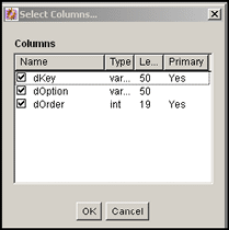
To access this screen, click Change Columns on the Info tab of the Add/Edit View Screen.
Add/Edit View Screen: Display Tab
This screen is used to specify rules for the display of the schema data.
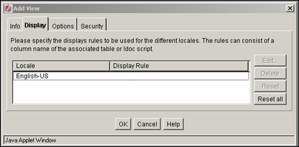
To access this screen, click Edit on the Configuration Manager: Views Tab Screen or click Add on the Configuration Manager: Views Tab Screen and follow the steps needed to create a view. Click the Display tab to open this screen.
| Element | Description |
|---|---|
|
Locale/Display Rule list |
Lists the defined display rules for the locales. |
|
Edit |
Opens the Edit Display Rule screen for the selected rule. |
|
Delete |
Enables deletion of the selected locale/display rule. |
|
Reset |
Resets the display rule for the selected locale. |
|
Reset all |
Resets all of the display rules for their respective locales. |
Display Tab: Edit Display Rule
This screen is used to alter the display rules for the schema.

To access this screen, click Edit on the Display tab.
Add/Edit View Screen: Options Tab
This screen is used to establish the sort order and criteria for the data in the schema.
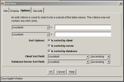
To access this screen, click Edit on the Configuration Manager: Views Tab Screen or click Add on the Configuration Manager: Views Tab Screen and follow the steps needed to create a view. Click the Options tab to open this screen.
| Element | Description |
|---|---|
|
Column list |
Columns selected using the Add View Screen: Select Columns Screen. |
|
Edit criteria fields |
Criteria used to narrow the table values for the view. |
|
Sort by |
Selects the database used for sorting. Options include client, server, or database. |
|
Sort Field lists |
Lists the columns to be used in sorting. |
|
Sort Order |
Sorts either in ascending or descending order. |
Add/Edit View Screen: Security Tab
This screen is used to establish the security rules to use for the schema.
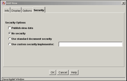
To access this screen, click Edit on the Configuration Manager: Views Tab Screen or click Add on the Configuration Manager: Views Tab Screen and follow the steps needed to create a view. Click the Security tab to display this screen.
| Element | Description |
|---|---|
|
Publish view data |
Makes the view visible to other users. |
|
No security |
Disables standard filter security for the schema. |
|
Use standard document security |
Provides a minimal level of security for the schema and the documents in the schema. |
|
Use custom security implementator |
Enables alteration of the security filter. |
This screen is used to select values assigned to the view for editing. The type of information displayed on this screen is dependent on the type of list chosen to use for the view.
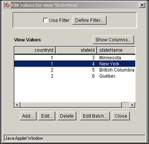
To access this screen, click Edit Values on the Configuration Manager: Views Tab Screen. This screen is identical to the Edit View Values Screen, which you can access through the Configuration Manager.
| Element | Description |
|---|---|
|
Use Filter |
If selected, applies the filter defined by the Define Filter Screen. |
|
Define Filter |
Opens the Define Filter Screen |
|
Show Columns |
Limits the number of columns to show in the view. |
|
Add or Edit |
Opens the Add/Edit Value Screen. |
|
Delete |
Enables deletion of a value from the table. |
|
Edit Batch |
Opens the Edit Values: Edit Batch screen. |
This screen is used to change the values in the view or to add a new column to the table associated with the new metadata field.
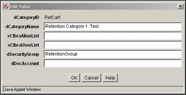
To access this screen, highlight a value assigned to the view on the Edit Values For Views Screen and click Edit.
This screen is used to alter large amounts of information in a line editor, compared to the single line edits made with the Edit Values For Views Screen, the Add/Edit Value Screen, or the Edit View Values Screen.
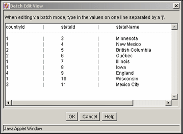
To access this screen, click Edit Batch on the Edit Values For Views Screen.
The existing columns in the table are displayed. Add values to the table by entering the data in the appropriate columns, separated by a pipe (|) symbol. Each row in the table should begin on a new line.
This screen lists the relationship between schema views and schema tables.
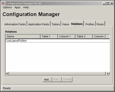
To access this screen, click the Relations tab on the Configuration Manager Page.
| Element | Description |
|---|---|
|
Relations list |
Lists the existing relationships between specific tables and columns. |
|
Add or Edit |
Opens the Add/Edit Relationship Screen. |
|
Delete |
Enables deletion of the selected relationship. |
This screen is used to add or alter a schema relationship between a table and a view.
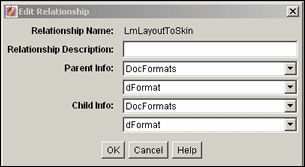
To access this screen, click Add or Edit on the Configuration Manager: Relations Tab.
| Element | Description |
|---|---|
|
Relationship Name |
Name of relationship being created or edited. |
|
Relationship Description |
Brief description of relationship. |
|
Parent Info list and field |
Table that determines choices in dependent choice list and the column in the parent table. |
|
Child Info list and field |
Table that is dependent on the choice from the parent table and the column in the child table. |
This screen provides a hierarchical view of the values in a list or table.
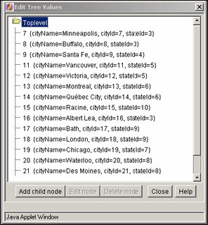
To access this screen, highlight a field associated with a table and click Edit Tree on the Configuration Manager: Information Field Tab Screen. If a list created with the Option List Screen is used, that list opens, not the hierarchical view of a tree.
| Element | Description |
|---|---|
|
Add Child Node |
Active when a parent node is selected. Opens the Add Node screen, which has the same functionality as the Add/Edit Value Screen. See that screen for details on use. |
|
Edit Child Node |
Active when a node is selected. Opens the Edit Node screen, which has the same functionality as the Add/Edit Value Screen. See that screen for details on use. |
|
Delete node |
Deletes a node from the table. If a parent is deleted, children are also deleted. |
The following screens are used in the creation of a content profile:
Section A.1.15.1, "Configuration Manager: Profiles Tab Screen"
Section A.1.15.6, "Check In/Search Link Screen: Conditions Tab, Custom Tab"
Section A.1.15.7, "Check In/Search Link: Add Condition Screen"
This screen is used to create, edit, delete, and preview profiles.
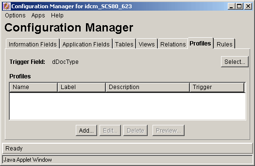
To access this screen, choose Administration then Admin Applets from the Main menu. Click Configuration Manager then the Profiles tab.
| Element | Description |
|---|---|
|
Profiles |
Lists the names of existing profiles and other information such as label, description, and the trigger (list values used to identify checked-in documents). Click Select to open the Edit Trigger Field Screen. |
|
Add or Edit |
Opens the Add Profile Screen. |
|
Delete |
Enables deletion of the selected profile. |
|
Preview |
Opens the Preview Profile Screen. |
This screen is used to select or change the trigger field.
Caution:
When a trigger field is changed, profiles can become invalid. It is the responsibility of the system administrator to resolve the situation. The user interface provides hints about invalid profiles.

To access this screen, click Select on the Configuration Manager: Profiles Tab Screen.
| Element | Description |
|---|---|
|
Field Name |
List metadata fields defined as lists. If none specified is used, profiles are disabled. |
This screen is used to create and name a new profile.

To access this screen, click Add on the Configuration Manager: Profiles Tab Screen.
This screen is used to define or edit a profile.
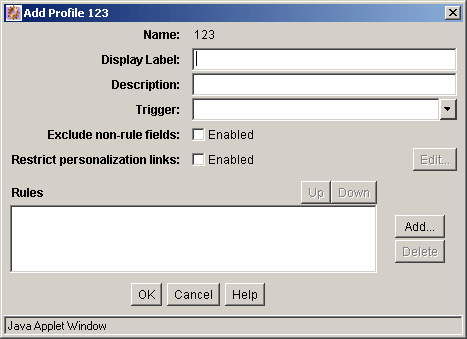
This screen opens when you click OK on the Add Profile Screen or when you select a profile on the Configuration Manager: Profiles Tab Screen and click Edit.
| Element | Description |
|---|---|
|
Name |
Name assigned to the profile using the Add Profile Screen. |
|
Display Label |
Name displayed in the My Check in and My Search profile links. |
|
Description |
Description of the profile. |
|
Trigger list |
List values associated with the profile trigger. |
|
Exclude non-rule fields |
If selected, excludes all metadata fields not belonging to the rules in the profile. If unselected, all metadata fields belonging to all rules are included. |
|
Restrict personalization links |
If selected, suppresses check-in or search links to a particular user or group of users. Click Edit to open the Profile Links Screen to edit how links are displayed. |
|
Rules pane |
Lists the rules included with the profile. |
|
Up/Down |
Adjusts the placement order of the rules in the list. The position of each rule in the list is relevant to its priority in the evaluation process. |
|
Add |
Opens the Add Rule in Profile Screen. |
|
Delete |
Enables deletion of the selected rule and removal of it from this profile. |
This screen is used to suppress the display of any or all check-in or search links to a particular user or group of user by adding Idoc Script code that must evaluate to true before the link is displayed in the browser.
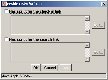
To access this screen, select Restrict personalization links on the Add/Edit Profile Screen and click Edit.
| Element | Description |
|---|---|
|
Has script for the check in link or search link |
If selected, the associated Idoc Script must evaluate to true before allowing the display of a link on the Content Check In Form or the Advanced Search Form. If unselected, disables any associated Idoc Script. |
|
Edit |
Opens the Check In/Search Link screen. |
This screen is used to add the conditions that determine if links are displayed on the check-in or search pages. For details about using the Conditions tab and the Custom tab, see Section A.1.16.4, "Edit Activation Condition Screen."
This screen is used to provide the name of the new condition. To access this screen, click Add on the Check In/Search Link Screen: Conditions Tab, Custom Tab. For details, see Section A.1.16.4, "Edit Activation Condition Screen."
This screen is used to include one or more rules in a profile.
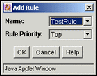
To access this screen, click Add on the Add/Edit Profile Screen.
| Element | Description |
|---|---|
|
Name |
The names of available rules that you can add. |
|
Rule Priority |
Adjusts the general placement order of the rules in the list on the Add/Edit Profile Screen. Options include Top, Middle, or Bottom. |
Use this screen to simulate and review rules and the trigger field in a profile.
To display the evaluation results in either a dialog or browser window click Compute results or Show.
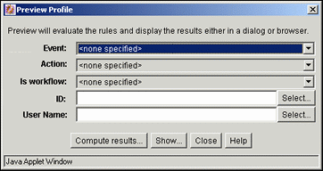
To access this screen, click Preview on the Configuration Manager: Profiles Tab Screen.
| Element | Description |
|---|---|
|
Event |
Specifies when an event is included in the profile evaluation. Options include:
|
|
Action |
Specifies when an action is included in the evaluation. Options include:
|
|
Is workflow |
Specifies when a workflow state is considered in the evaluation.
|
|
Content ID |
Content ID of the selected document to use in the evaluation. The value is based on the selected filter criteria. Click Select to open the Content Item View Screen to select other content. |
|
User Name |
Name used in the evaluation. The value is based on the selected filter criteria. This field is only used with Compute results and is not used with Show. Click Select to open the User View Screen. |
|
Compute Results |
Opens the Preview Results Screen. |
|
Show |
Launches a browser window showing a duplicate of the page that the end user sees. It is necessary to select On Request as the Event field value, select an Action value, and leave the User Name field blank. |
This screen is used to compute and review the selections made on the Preview Profile screen. It shows the coded rule statements (script strings) that result from the preliminary evaluation and reflects any field value changes made to facilitate previewing various profile scenarios.
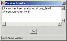
To access this screen, click Compute results on the Preview Profile Screen.
The following screens are used to create profile rules:
This screen is used to create, define, edit, and delete content profile rules.
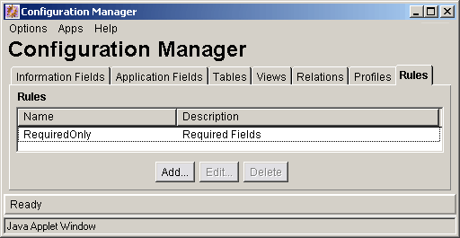
To access this screen, choose Administration then Admin Applets from the Main menu. Click Configuration Manager then click the Rules tab.
| Element | Description |
|---|---|
|
Name |
Names of the existing rules. |
|
Description |
Description of each rule. |
|
Add/Edit |
Opens the Add/Edit Rule Screen where the rule is configured. |
|
Delete |
Enables deletion of the selected rule. |
This screen has two tabs used to specify rule information and fields for profiles.
Add/Edit Rule Screen: General Tab
This screen is used to specify global rules, define rule groups with optional headers, and define activation conditions.
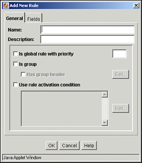
To access this screen, click Add or Edit on the Configuration Manager: Rules Tab Screen.
| Element | Description |
|---|---|
|
Name |
Name of the rule being defined or edited. |
|
Description |
Description of the rule. |
|
Is global rule with priority and priority field |
If selected, enables this as a global rule. The priority field determines the order in which the rule is evaluated. A lower priority rule is executed before higher priority rules, allowing higher priority rules to override the changes made by lower priority rules. |
|
Is group |
If selected, groups metadata fields. If unselected, disables field grouping for the rule. |
|
Has group header |
If selected, enables the addition of a label to a group of fields belonging to the rule. Click Edit to open the Edit Group Header Screen to specify header formatting. |
|
Use rule activation condition |
If selected, enables a profile to change based on rules that are applied or suppressed if specific conditions are met. Sets an activation condition for the rule being defined or edited. The Activation Condition text pane becomes active and displays the computed Idoc Script for each activation condition for the rule. The script statements are automatically generated after the condition is added and its properties are defined. Customized text is also displayed. Click Edit to open the Edit Activation Condition Screen to add or alter conditions. |
Add/Edit Rule Screen: Fields Tab
This screen is used to select and add specific metadata fields for use in the rule.
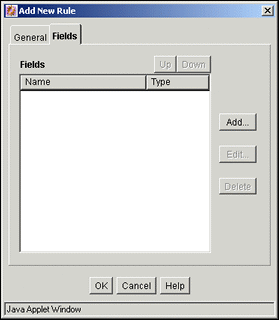
Each metadata field is assigned specific attributes such as the general position within the list of fields in the rule and a display type. For more information about assigning attributes to metadata fields in rules, see Section A.1.16.5, "Add Rule Field Screen" and Section A.1.16.6, "Add/Edit Rule Field 'name' Screen."
To access this screen, click Add or Edit on the Configuration Manager: Rules Tab Screen and click the Fields tab.
| Element | Description |
|---|---|
|
Up or Down |
Adjusts the placement order of the metadata fields in the list. The position of each metadata field in the list is relevant to its priority in the evaluation process. |
|
Name |
The metadata fields belonging to the rule. |
|
Type |
The kind of display attribute assigned to each metadata field. |
|
Add |
Opens the Add Rule Field Screen. |
|
Edit |
Opens the Add/Edit Rule Field 'name' Screen. |
|
Delete |
Enables deletion of the selected field and removal of it from this rule. |
This screen is used to add or edit a header for a group of metadata fields.
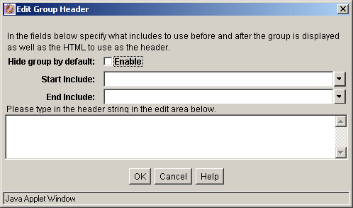
To access this screen, select Is group and Has group header and click the corresponding Edit button on the Add/Edit Rule Screen, General tab.
| Element | Description |
|---|---|
|
Hide Group by default |
If selected, only the group header with a Show link appears when the page loads. If unselected, fields are displayed on pages with a Hide link, you can click to hide the metadata fields. |
|
Start and End Include |
Specifies include files that determine layout. Options can be:
|
|
Header text pane |
Text for the header. |
This screen is used to define specific conditions for a rule.
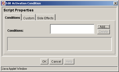
To access this screen, select Use rule activation condition and click Edit on the Add/Edit Rule Screen.
The Conditions tab and Custom tab are mutually exclusive. If the Conditions tab is used to define rule conditions, the Custom tab is disabled.
| Element | Description |
|---|---|
|
Conditions pane |
Activation conditions created for the rule. |
|
Add |
Opens a dialog used to enter a condition name. |
|
Delete |
Enables deletion of the selected activation condition and removal of it from the rule. |
Edit Activation Condition: Conditions Tab
This screen is used to add activation conditions and define them using the General and Clauses panes which are displayed after adding the first condition.
Edit Activation Condition: Conditions Tab: General Pane
This pane is used to specify the event, action, or state that triggers the activation condition of the rule.
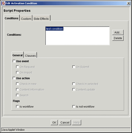
The General and Clauses panes open when you click Add and specify an activation condition.
| check box | Description |
|---|---|
|
Use event |
If selected, enables a profile, rule or both to perform differently using activation conditions based on events as determined by the system. Depending on the event, some profile rules are activated while others are not. Events include:
|
|
Use action |
If selected, enables a profile, rule or both to perform differently using activation conditions based on a user action detected by the system. Check boxes for these events are enabled when the Use Action check box is selected:
|
|
Is/Is Not in Workflow |
If selected, enables a rule to perform differently based on the workflow state of a document. Depending on the state, some profile rules are activated while others are not. |
Edit Activation Condition: Conditions Tab: Clauses Pane
This section is used to generate custom Idoc Script clauses for the activation condition of the rule.
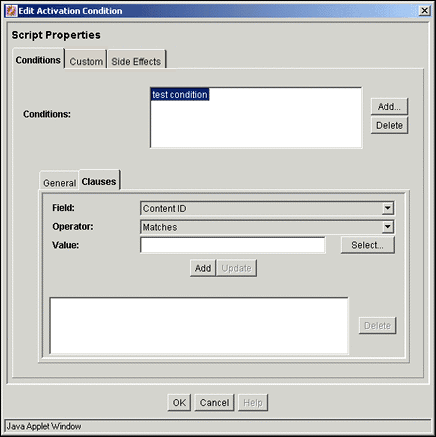
The General and Clauses tabs open after adding an activation condition. The Clauses tab is essentially an Idoc Script wizard. It is primarily used to automate the process of creating Idoc Script statements.
| Element | Description |
|---|---|
|
Field |
A list of metadata options. |
|
Operator |
The method used for searching the metadata fields. Operators include:
|
|
Value |
Depending on the selected field, the value can be an editable field to enter data, a list of options, or an editable field which activates the Select button. If the field value is Content ID, click Select to open the Custom pane. If the field is author, a selection screen of users opens. |
|
Add |
Adds the completed clause (Field + Operator + Value) to the Clause pane. |
|
Update |
Used to edit the completed clause without deleting and redefining the clause. Highlight the clause in the Clause pane, edit the Value field, and click Update. The revised clause appears in the Clause pane. |
|
Clause pane |
Lists the existing clauses for the activation condition. |
|
Delete |
Enables deletion of the selected clause. |
Edit Activation Condition: Custom Tab
The Custom tab and Conditions tab are mutually exclusive. If the Custom tab is used to define rule conditions, the Conditions tab is disabled for the current rule.
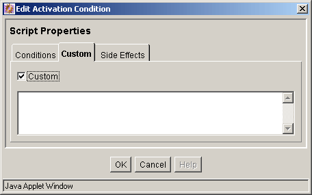
You can access this screen from various points in the user interface.
To use this screen, select Custom. The text pane is then enabled where you can enter custom text. The information entered is displayed in the text pane on the Add/Edit Rule Screen.
Edit Activation Condition: Side Effects Tab
This screen is used to define specific side effects of conditions.
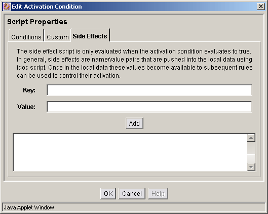
To access this screen, click Side Effects on the Edit Activation Condition Screen.
| Element | Description |
|---|---|
|
Key |
Name used as the Idoc Script variable. |
|
Value |
Literal string equating to the Idoc Script variable. |
|
Add |
Converts the key and value to Idoc Script and displays it in the Idoc Script pane. |
This screen is used to include one or more metadata fields in the rule.
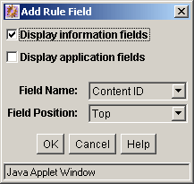
To access this screen, click Add on the Add Rule in Profile Screen, Fields Tab.
This screen is used to add and define the required and optional attributes to the metadata fields belonging to a rule.
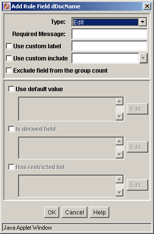
This screen opens after adding a metadata field using the Add Rule Field Screen. When editing an existing metadata field (selected from the list on the Add/Edit Rule Screen, Field Tab), this screen opens when you click Edit.
Note:
The standard include file options listed in the Start Include and End Include lists are defined in the DpDisplayIncludes table of the std_resources.htm file. To add additional include options, a custom component must be written defining the new includes and merging them into the DpDisplayIncludes table.
This screen is used to add and define default value field attributes. For details about using the Conditions and Custom tab, see Section A.1.16.4, "Edit Activation Condition Screen."
To access this screen, select Use default value and click the corresponding Edit button on the Add/Edit Rule Field 'name' Screen.
This screen is used to select a default metadata value to include when the completed default value clause (Field + Operator + Value) is processed. Schema values can also be used to create the default value field attribute if the metadata field is associated with a schema view.
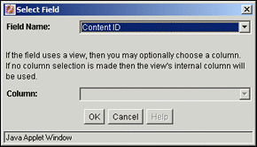
To access this screen, click Compute on the Edit Default/Derived Value Screens.
| Element | Description |
|---|---|
|
Field Name |
Opens a list of metadata options. |
|
Column |
Opens a list of table columns. A column is shown only if the metadata field is associated with a schema view. |
This screen is used to add and define derived value field attributes. For details about using the Conditions or Custom tab, see Section A.1.16.4, "Edit Activation Condition Screen."
This screen is used to allow the list metadata field (on presentation) to be restricted to either a specific list of values or to a filtered list of values resulting from the evaluation process of one or more regular expressions. This choice determines how the system interprets the values entered in the text pane.
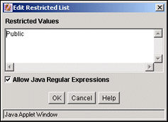
To access this screen, select Has restricted list and click the corresponding Edit button on the Add/Edit Rule Field 'name' Screen.
| Element | Description |
|---|---|
|
Restricted value text pane |
Allows entry of specific items to be included in the modified list. If the metadata field for this restricted list was defined as a list, the displayed results in the user interface includes the values entered in this pane if they are also in the master list. |
|
Allow Java Regular Expressions |
If selected, enables display of a filtered list of values based on the evaluation of one or more regular expressions. Using wildcards and other special characters in the expression displays a subset of all values in the metadata field's usual list that match the evaluated regular expression. If unselected, enables display of a specific set of actual values specified in the text pane if each value is in the master list. This selection overrides the metadata field's master list and sets the list to a specified set of values. The values are not evaluated, so whatever is entered into the text pane is displayed. |
This section contains information about the interface screens used with workflows. It covers the following topics:
This screen is used to manage workflows.
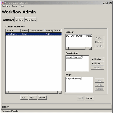
To access this screen, choose Administration then Admin Applets from the Main menu. Click Workflow Administration.
| Element | Description |
|---|---|
|
Page Menus |
The Options menu is used to access screens to create tokens, templates, and other workflow functionality. The Apps menu accesses other applications, which open in the same mode (applet or standalone) as the current application. |
|
Tabs |
The tabs are used to add, edit, or delete the item noted on the tab (Basic workflows, Criteria workflows, or templates). |
The following screens are used in the creation of criteria workflows:
This screen is used manage all aspects of Criteria workflows and sub-workflows.
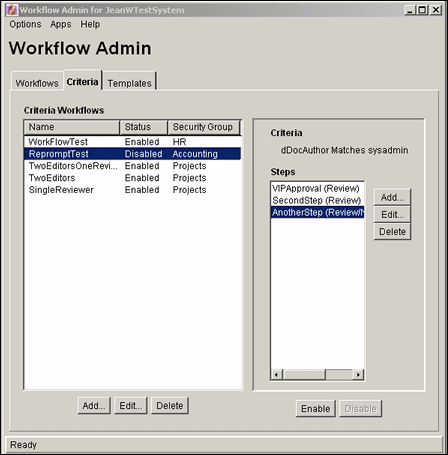
To access this screen, click the Criteria tab on the The Workflow Admin Screen.
| Element | Description |
|---|---|
|
Criteria Workflow pane |
Columns:
Buttons:
|
|
Criteria Step pane |
Buttons:
|
This screen is used to add or edit a Criteria workflow or sub-workflow.
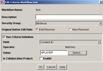
To access this screen, click Add or Edit in the Criteria Workflow pane of the Criteria Tab.
| Element | Description |
|---|---|
|
Workflow Name |
Name for the workflow. |
|
Description |
Description of the workflow. |
|
Security Group |
Security group the revision must be in to enter the workflow. |
|
Use Template |
If selected, uses a workflow template and displays a list. Only displayed if at least one workflow template exists. |
|
Original Author Edit Rule |
If Edit Revision is selected, keeps the content in the workflow at the existing revision when the original author edits it. If New Revision is selected, the original author can create a new revision of the content after editing the item during workflow. |
|
Has Criteria Definition |
If selected, a criteria definition is created. If unselected, a sub-workflow is created. |
|
Field |
Field evaluated when each content item is checked in. Options are Content ID, Author, Type, Comment, Account (if accounts are enabled), and any custom metadata fields. |
|
Operator |
Defaults to Matches. |
|
Value |
Value for the field. Use the asterisk (*) as a wildcard to match one or more characters or the question mark (?) to match one character. click Select to display a list of existing items to use. |
This screen is used to add or edit a Criteria workflow step.
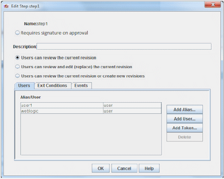
To access this screen, select a workflow in the left pane and click Add or Edit in the right pane of the Criteria Tab.
| Element | Description |
|---|---|
|
Name |
Name for the step. |
|
Requires signature on approval |
If selected, the user must provide credentials for an electronic signature to approve the revision. The standard Approve action is replaced by the Sign and Approve action in the list of step options. This option is only available if you enabled the Electronic Signatures component. |
|
Description |
Description for the step. |
|
User check boxes |
Selections determine the actions users can take on an item in the workflow. |
Users Tab Fields
| Element | Description |
|---|---|
|
Alias/User list |
Lists the users, aliases, and tokens assigned to the step. |
|
Add Alias, Add User, Add Token |
Opens the appropriate screen where you can select an alias, user or a token. |
|
Delete |
Deletes the highlighted item. |
Exit Conditions Tab Fields
| Element | Description |
|---|---|
|
Reviewers and field |
Determines how many users must approve the revision before the workflow passes to the next step. |
|
Use Additional Exit Condition |
Lists additional conditions to be met before the workflow passes to the next step. |
|
Edit |
Opens the Edit Additional Exit Condition Screen. |
Events Tab Fields
This screen is used to assign aliases to a Criteria workflow step.
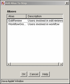
To access this screen, click Add Alias on the Users tab of the Add New/Edit Step Screen. Select an alias from the list and click OK.
This screen is used to assign users to a Criteria workflow step.
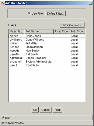
To access this screen, click Add User on the Users tab of the Add New/Edit Step Screen. See Section A.1.2.3, "Define Filter Screen" and Section A.1.2.4, "Show Columns Screen" for details about filtering information. To add a user, select the user name and click OK.
This screen is used to assign workflow tokens to a Criteria workflow step.
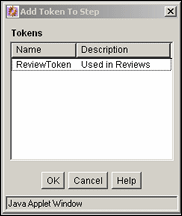
To access this screen, click Add Token on the Users tab of the Add New/Edit Step Screen. This screen is only accessible if tokens are added to the system.
This screen is used to define exit conditions for a Criteria workflow step.
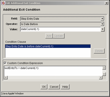
To access this screen, click Edit on the Exit Conditions tab of the Add New/Edit Step Screen.
| Element | Description |
|---|---|
|
Field |
The workflow condition or metadata field to be evaluated. |
|
Operator |
Operator (such as 'Matches') to use with the field. |
|
Value |
Value for the field. Use an asterisk (*) as a wildcard to match one or more characters or a question mark (?) to match a single character. Click Select to open a list of existing items to use for a value in the field. This button appears only when certain metadata fields are selected. |
|
Add |
Adds the conditional statement defined by the Field, Operator, and Value fields to the exit condition clause. |
|
Update |
Changes the selected conditional statement to the statement defined by the Field, Operator, and Value fields. |
|
Condition Clause pane |
Lists the conditional statements that were added to the exit condition. You can append multiple clauses as AND statements. |
|
Delete |
Deletes the selected conditional statement. |
|
Custom Condition Expression |
If selected, enables display and edit of the Idoc Script generated from the condition clauses. Additional conditions must be Idoc Script statements that evaluate to true or false. The code must not be enclosed in Idoc Script tags If unselected, the expression reverts to its original definition. All modifications are lost. |
The following screens are used in the creation of Basic workflows:
Section A.2.3.3, "Add Content to Workflow (New Content) Screen"
Section A.2.3.4, "Add Content to Workflow (Existing Content) Screen"
Many of the screens used in the creation of the Criteria workflow are the same screens used in Basic workflows. They are repeated here for completeness.
This screen is used to add, edit, start, cancel, and delete Basic workflows.

To access this screen, click the Workflows tab on the The Workflow Admin Screen.
| Element | Description |
|---|---|
|
Current Workflow pane |
Columns:
Buttons:
|
|
Content pane |
Lists the content items included in the selected workflow. Buttons:
|
|
Contributors pane |
Lists the users, aliases, and tokens assigned to the initial contribution step of the selected workflow. Buttons:
|
|
Steps pane |
Lists the steps and step types included in the selected workflow. Buttons
|
|
Screen Buttons |
|
This screen is used to add or edit a Basic workflow.
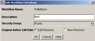
To access this screen, click Add or Edit in the Current Workflows pane of the Workflow Admin: Workflows Tab.
| Element | Description |
|---|---|
|
Workflow Name |
Name for the workflow. |
|
Description |
Description of the workflow. |
|
Security Group |
Security group for the content items. |
|
Original Author Edit Rule/New Revision |
If selected, permits the original author to create a revision of the content when the author edits the content item. |
|
Use Template |
If selected, uses a template and displays a list of templates for use. This box is displayed only if a template exists. |
This screen is used to specify a new content item for a Basic workflow.
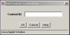
To access this screen, select a workflow in the left pane and click New in the Content pane of the Workflow Admin: Workflows Tab.
| Element | Description |
|---|---|
|
Content ID |
The content to add to the workflow. If using an Oracle database, all Content IDs are converted to uppercase letters automatically. |
This screen is used to add existing content items to a Basic workflow.
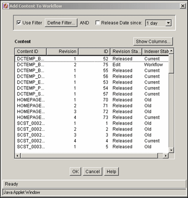
To access this screen, select a workflow and click Select in the Content pane of the Workflow Admin: Workflows Tab. See Section A.1.2.3, "Define Filter Screen" and Section A.1.2.4, "Show Columns Screen" for details about filtering information. To add content, select the content and click OK.
This screen is used to assign alias groups to the initial contribution step of a Basic workflow.
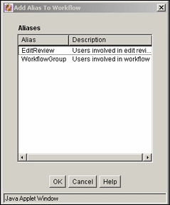
To access this screen, select a workflow and click Add Alias in the Contributors pane of the Workflow Admin: Workflows Tab. To add an alias, select the alias and click OK.
This screen is used to add or edit a Basic workflow review step.

To access this screen, select a workflow and click Add or Edit in the Steps pane of the Workflow Admin: Workflows Tab.
| Element | Description |
|---|---|
|
Name |
Name for the step. |
|
Description |
Description for the step. |
|
User check boxes |
Select to choose the actions users can take on an item in the workflow. |
Users Tab Fields
| Element | Description |
|---|---|
|
Alias/User list |
Lists the users, aliases, and tokens assigned to the step. |
|
Add User, Add Alias, Add Token |
Opens the appropriate screen where you can add an alias, user or a token. |
Exit Conditions Tab Fields
| Element | Description |
|---|---|
|
Reviewers option |
Determines how many users must approve the revision before the workflow passes to the next step. |
|
Use Additional Exit Condition |
Lists additional conditions to be met before the workflow passes to the next step. Click Edit to open the Edit Additional Exit Condition Screen. |
Events Tab Fields
For details, see Section A.2.5.1, "Add New/Edit Step Screen: Events Tab."
This screen is used to assign aliases to a Basic workflow review step.

To access this screen, click Add Alias on the Add New/Edit Step Screen. To add an alias to the workflow, select the alias and click OK.
This screen is used to assign users to a Basic workflow step.

To access this screen, do one of the following:
For the contribution step, select a workflow in the left pane and click Add User in the Contributors pane of the Workflow Admin: Workflows Tab.
For a review step, click Add User on the Add New/Edit Step Screen.
See Section A.1.2.3, "Define Filter Screen" and Section A.1.2.4, "Show Columns Screen" for details about filtering information. To add the user, select the name and click OK.
This screen is used to assign a workflow token to a Basic workflow review step.

To access this screen, click Add Token on the Add New/Edit Step Screen. To add the token, select the token and click OK.
This screen is used to define exit conditions for a Basic workflow review step.

To access this screen, click Edit in the Exit Conditions tab of the Add New/Edit Step Screen.
| Element | Description |
|---|---|
|
Field |
workflow condition or metadata field to be evaluated. |
|
Operator |
Operator (such as 'Matches') to use with the field. |
|
Value |
Value for the field. Use an asterisk (*) as a wildcard to match one or more characters or a question mark (?) to match a single character. Click Select to display a list of items to use for a value in the field. This button only appears when certain metadata fields are selected. |
|
Add |
Adds the conditional statement defined by the Field, Operator, and Value fields to the exit condition clause. |
|
Update |
Changes the selected conditional statement to the statement defined by the Field, Operator, and Value fields. |
|
Condition Clause pane |
Lists the conditional statements that were added to the exit condition. You can append multiple clauses as AND statements. |
|
Delete |
Deletes the selected conditional statement. |
|
Custom Condition Expression |
If selected, enables display and edit of the Idoc Script generated from the condition clauses. Additional conditions must be Idoc Script statements that evaluate to true or false. The code must not be enclosed in Idoc Script tags If unselected, the expression reverts to its original definition. All modifications are lost. |
This screen is used to start a Basic workflow and add to the e-mail message that is sent to initial contributors.
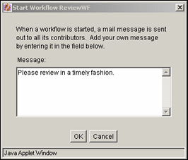
To access this screen, select a workflow and click Start on the Workflow Admin: Workflows Tab.
The following screens are all used in the creation and editing of tokens:
This screen is used to add, edit, and delete workflow tokens.
The predefined tokens in the Name list are associated with the sample workflow template that is included with the Workflow Admin application. Use these tokens as is, or use them as a basis to customize site-specific tokens.
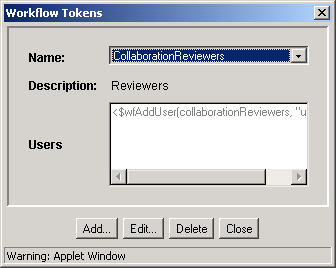
To access this screen, choose Tokens from the Options menu on the Workflow Admin: Workflows Tab.
| Element | Description |
|---|---|
|
Name |
Lists the token names. |
|
Description |
The description of the selected token. |
|
Users pane |
Shows the Idoc Script code that defines the token. |
|
Buttons |
|
This screen is used to add or edit a workflow token.
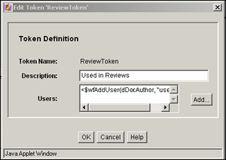
To access this screen, click Add or Edit on the Workflow Tokens Screen.
| Element | Description |
|---|---|
|
Token Name |
The name of the token. |
|
Description |
Description of the token. |
|
Users pane |
The Idoc Script code that defines the token. |
|
Add |
Opens the Add Token User Screen. |
This screen is used to add a user or alias to a workflow token.
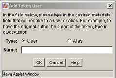
To access this screen, click Add on the Add/Edit Token Screen.
| Element | Description |
|---|---|
|
Type options |
|
|
Name |
The metadata corresponding to a user (dDocAuthor) or the alias. |
The following screens are used to create jumps:
This screen is used to add or edit step event scripts.
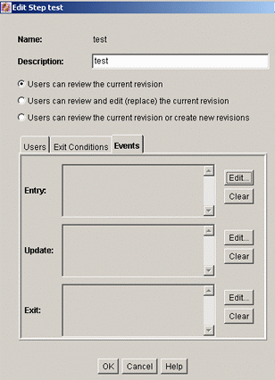
To access this screen, click the Events tab on the Add New/Edit Step Screen for a Criteria workflow or the Add New/Edit Step Screen for a Basic workflow.
| Element | Description |
|---|---|
|
Name field |
The name for the step. |
|
Description field |
A description for the step. |
|
User check boxes |
Used to determine the actions users can take on an item in the workflow. |
|
Entry pane |
Displays the script that is evaluated when the step is entered. Buttons:
|
|
Update pane |
Displays the script that is evaluated when any of the following events occurs:
Buttons:
|
|
Exit pane |
Displays the script that is evaluated when the revision has completed the requirements of the workflow step. Buttons:
|
This screen is used to select an editing option for a step event script.
To access this screen, click Edit for the event on the Add New/Edit Step Screen: Events Tab.
| Element | Description |
|---|---|
|
Edit Current |
If selected, opens the Jump tab with the current script. This option is displayed only if a script exists for the event. |
|
Create New |
If selected, opens a blank Jumps tab. |
|
Use Script Template |
If selected, opens the Jumps tab with the selected script template. This option is displayed only if a script template exists. |
This screen is used to create, modify, and test step event scripts.
To access this screen, do one of the following:
If an event script or script template does not exist, click Edit on the Add New/Edit Step Screen: Events Tab.
If an event script or script template exists, click OK on the Edit Script for <StepName> Screen.
Script Properties: Jumps Tab
This screen is used to create step event script code.
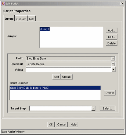
To access this screen, click the Jumps tab on the Script Properties Screen.
| Element | Description |
|---|---|
|
Jumps pane |
Lists the jumps included in the script. Buttons:
|
|
Center pane |
|
|
Add |
Adds the conditional statement defined in the center pane to the jump. |
|
Update |
Changes the selected conditional statement to the statement defined in the center pane |
|
Script Clauses pane |
Lists the conditional statements added to the jump. You can append multiple clauses as AND statements. |
|
Delete |
Deletes the selected conditional statement. |
|
Target Step list |
Specifies a target step for the jump. Choose a value to specify a symbolic step name. Click Select to choose a step from a list. |
Script Properties: Custom Tab
This screen is used to edit the script that was generated automatically by the options on the Jumps tab.
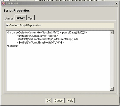
To access this screen, click the Custom tab on the Script Properties Screen.
| Element | Description |
|---|---|
|
Custom Script Expression |
If selected, you can edit and save the script revision. If unselected, the script reflects the statements defined on the Jumps tab. You cannot edit jumps from the Jumps tab. |
|
Script pane |
Shows the script of all jumps in the script template. |
Script Properties: Test Tab
This screen is used to test a step event script.
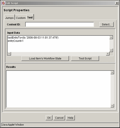
To access this screen, click the Test tab on the Script Properties Screen.
| Element | Description |
|---|---|
|
Content ID |
Content ID for a content item to be tested. Click Select to open a screen where you can select a content item. |
|
Input Data pane |
Displays the data that is tested when a workflow is selected and the content items's workflow state is loaded. |
|
Load Item's Workflow State |
Loads the companion file for the selected content item. If the selected content item is not in a workflow, the content item is treated like it newly entered the workflow. |
|
Test Script |
Tests the script and displays the results in the Results pane. |
|
Results pane |
Displays the results of the script test. Idoc script error messages are displayed processing errors occurred. |
This screen is used to add a specific target step to a jump.
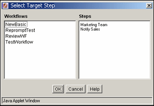
To access this screen, click Select on the Script Properties Screen, Jump Tab. Choose a workflow to display the steps. Select the step to use in the target and click OK.
This screen is used to add or edit jump side effects and notification messages.
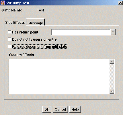
To access this screen, click Add or Edit in the Jumps pane of the Script Properties Screen, Jump Tab.
| Element | Description |
|---|---|
|
Side Effects tab |
Used to specify the jump name, return point, custom side effects, and to enable notification for the jump. |
|
Message tab |
Used to enter a notification message for the jump. |
Add/Edit Jump Screen: Side Effects Tab
This screen is used to add or edit jump side effects.

To access this screen, click the tab on the Script Properties Screen, Jump Tab.
| Element | Description |
|---|---|
|
Jump Name field |
Name of the jump. |
|
Has return point |
If selected, a return step, selected from the list, is used. |
|
Do not notify users on entry |
If selected, reviewers for the step receive the message defined on the Message tab when the jump is entered. |
|
Release document from edit state |
If selected, a document is released before approval. |
|
Custom Effects pane |
Area used to enter custom side effects using Idoc script. |
Add/Edit Jump Screen: Message Tab
This screen is used to enter a notification message for the jump. To change a notification message, use Component Architecture to customize the following include files and templates. These files contain the default mail information:
wf_approve_mail_subject include file
wf_approve_mail_message include file
wf_started_subject include file
wf_rejected_subject include file
reviewer_mail.htm template
reject_mail.htm template
contributor_mail.htm template
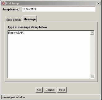
To access this screen, click the Message tab on the Script Properties Screen.
This screen is used to select an existing revision for event script testing purposes.

To access this screen, click Select on the Script Properties Screen, Test Tab. See Section A.1.2.3, "Define Filter Screen" and Section A.1.2.4, "Show Columns Screen" for details about filtering information. To choose a revision, select the revision and click OK.
The following screens are used to create templates:
This screen is used to add, edit, and delete workflow templates.
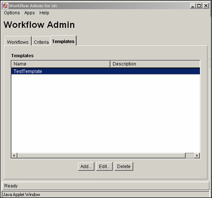
To access this screen, click the Templates tab on The Workflow Admin Screen.
| Element | Description |
|---|---|
|
Columns |
|
|
Buttons |
|
This screen is used to add or edit a workflow template.
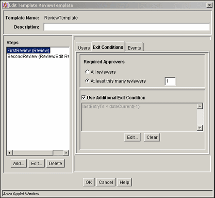
To access this screen, click Add or Edit on the Workflow Admin: Templates Tab.
| Element | Description |
|---|---|
|
Template Name |
Name of the template. |
|
Description |
Description of the template. |
|
Steps pane |
The steps included in the workflow template. Buttons:
|
|
User tab |
Lists the users, aliases, and tokens assigned to the selected step. Buttons:
|
|
Exit Conditions tab |
Lists the exit conditions to be met for the step.
Buttons:
|
Events Tab Fields
For details, see Section A.2.5.1, "Add New/Edit Step Screen: Events Tab."
This screen is used to add or edit a step in a workflow template.
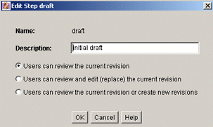
To access this screen, select a step and click Add or Edit in the Steps pane of the Add/Edit Template Screen.
| Element | Description |
|---|---|
|
Name field |
Name for the step. |
|
Description field |
Description for the step. |
|
Review options |
Determines the actions users can take on an item in the step. |
This screen is used to assign aliases to a workflow template step.

To access this screen, click Add Alias on the Users tab of the Add/Edit Template Screen. To add an alias, select the alias and click OK.
This screen is used to assign users to a workflow template step.

To access this screen, click Add User on the Users tab of the Add/Edit Template Screen. See Section A.1.2.3, "Define Filter Screen" and Section A.1.2.4, "Show Columns Screen" for details about filtering information. To add a user, select the user and click OK.
This screen is used to assign workflow tokens to a workflow template step.

To access this screen, click Add Token on the Users tab of the Add/Edit Template Screen. To use a token, select the token and click OK.
This screen is used to define exit conditions for a workflow template step.

To access this screen, click Edit on the Exit Conditions tab of the Add/Edit Template Screen.
| Element | Description |
|---|---|
|
Field |
Workflow condition or metadata field to be evaluated. |
|
Operator |
Operator (such as 'Matches') to use with the field. |
|
Value |
Value for the field. Use an asterisk (*) as a wildcard to match one or more characters or a question mark (?) to match a single character. Click Select (if available) to choose a value for the field. |
|
Add |
Adds the conditional statement defined by the Field, Operator, and Value fields to the exit condition clause. |
|
Update |
Changes the selected conditional statement to the statement defined by the Field, Operator, and Value fields. |
|
Condition Clause pane |
Lists the conditional statements added to the exit condition. You can append multiple clauses as AND statements. |
|
Delete |
Deletes the selected conditional statement. |
|
Custom Condition Expression |
Enables display and edit of the Idoc Script generated from the condition clauses. |
The following screens are used to create workflow scripts:
This screen is used to add, edit, and delete script templates.
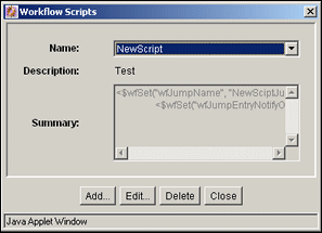
To access this screen, choose Script Templates from the Options menu in The Workflow Admin Screen.
| Element | Description |
|---|---|
|
Fields |
|
|
Buttons |
|
This screen is used to create, modify, and test script templates.

To access this screen, click Add or Edit on the Workflow Scripts Screen.
This screen is used to create the script template code.

To access this screen, click the Jumps tab on the Add/Edit Script Screen.
| Element | Description |
|---|---|
|
Jumps pane |
Lists the jumps included in the script. Buttons:
|
|
Center pane |
Buttons:
|
|
Script Clauses pane |
Lists the conditional statements added to the jump. You can append multiple clauses as AND statements. Click Delete to remove a selected statement. |
|
Target Step |
Specifies a target step for the jump. Click Select to choose a step from a list. |
This screen is used to edit the script that was generated automatically by the options on the Jumps tab.

To access this screen, click the Custom tab on the Add/Edit Script Screen.
| Element | Description |
|---|---|
|
Custom Script Expression |
If selected, you can edit and save the script revision. If unselected, the script reflects the statements defined on the Jumps tab. The expression reverts to its original definition. |
|
Script pane |
Shows the script of all jumps in the script template. |
This screen is used to test a script template.

To access this tab, click the tab on the Add/Edit Script Screen.
| Element | Description |
|---|---|
|
Content ID |
The Content ID for a content item to be tested. Enter an ID or click Select to open a screen where you can select items. |
|
Input Data pane |
Shows the data that is tested when a workflow is selected and when the content items's workflow state is loaded. |
|
Load Item's Workflow State |
Loads the companion file for the selected content item. If the selected content item is not in a workflow, the content item is treated like it newly entered the workflow. |
|
Test Script |
Tests the script and displays the results in the Results pane. |
|
Results pane |
The results of the script test. Idoc script error messages are displayed if there are processing errors. |
This screen is used to add or edit jump side effects and notification messages for a script template.

To access this screen, click Add or Edit in the Jumps pane of the Add/Edit Script Screen: Jumps Tab.
| Element | Description |
|---|---|
|
Side Effects tab |
Used to specify the jump name, return point, custom side effects, and to enable notification for the jump. |
|
Message tab |
Used to enter a notification message for the jump. |
This screen is used to add or edit jump side effects for a script template.

To access this tab, click the Side Effects tab on the Add/Edit Jump Screen.
| Element | Description |
|---|---|
|
Jump Name |
Name of the jump. |
|
Has return point |
If selected, a return step is used. |
|
Do not notify users on entry |
If selected, reviewers for the step receive the message defined on the Message tab when the jump is entered. |
|
Release document from edit state |
If selected, a document is released before approval. |
|
Custom Effects pane |
Used to enter custom side effects using Idoc script. |
This screen is used to enter a notification message for a jump in a script template.

To access this screen, click the Message tab on the Add/Edit Jump Screen.
This screen is used to select an existing revision for script template testing purposes.

To access this screen, click Select on the Add/Edit Script Screen: Test Tab. See Section A.1.2.3, "Define Filter Screen" and Section A.1.2.4, "Show Columns Screen" for details about filtering information. To use a revision, select the item and click OK.
This screen is used to select an existing workflow step for script template testing purposes.
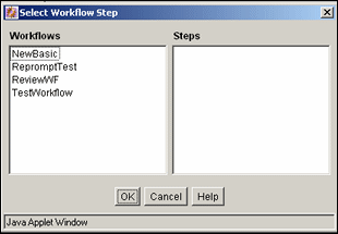
To access this screen, click Select Workflow on the Add/Edit Script Screen: Test Tab.
| Element | Description |
|---|---|
|
Workflows |
Select a workflow to display the workflow steps in the Steps field. |
|
Steps |
The selected step is used for testing purposes. |
This section describes the PDF Watermark interface screens.
This section covers the following topics:
The PDF Watermark Administration screen is used to specify rules, templates, and metadata values for templates used in watermarking content. To access this screen choose Administration then PDF Watermark Administration from the Main menu.
| Tabs | Description |
|---|---|
|
Rules |
Opens the Rules Tab. |
|
Templates |
Opens the Templates Tab. |
|
Configuration |
Opens the Configuration Tab. |
This screen is used to define a rule or ruleset, which determines which content is dynamically watermarked, upon user request.
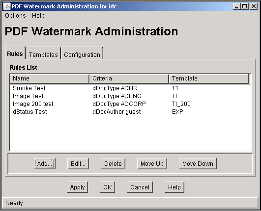
To access this screen, click the Rules tab on the PDF Watermark Administration Screen.
| Element | Description |
|---|---|
|
Add or Edit |
Opens the Add New/Edit Rule Screen. |
|
Delete |
Removes the selected rule from the list. |
|
Move Up/Down |
Adjusts the placement order of the selected rule relevant to its priority. The higher or lower a rule in the list, the higher or lower its priority is in the hierarchy. |
This screen is used to specify a rule or edit a rule for a PDF watermark template.
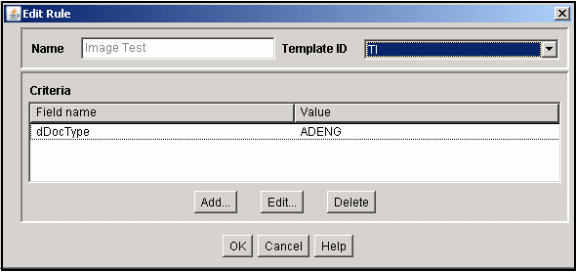
To access this screen, click Add on the Rules Tab.
| Field | Description |
|---|---|
|
Name |
The rule name. |
|
Template ID |
Content ID of the template. |
|
Add or Edit |
Adds new criteria to the rule or displays the criteria for editing. Specify a value for any or all of the available criteria. |
This screen is used to add a new criteria or change an existing one.
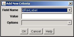
To access this screen, click Add or Edit on the Add New/Edit Rule Screen.
| Field | Description |
|---|---|
|
Field Name |
Name of the new or edited field. |
|
Value |
Name of the trigger value (criteria for use). |
|
Options |
If the field is a List, values appear on the list. |
Use this screen to design and edit watermark templates.
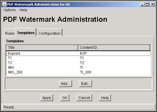
To access this screen, click Templates on the PDF Watermark Administration Screen.
| Element | Description |
|---|---|
|
Add and Edit |
Opens the Add New/Edit Template Screen. |
This screen is used to specify values for a template for PDF watermarks.
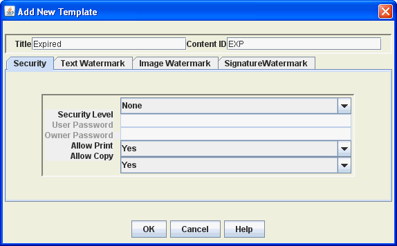
To access this screen, click Add or Edit on the Templates Tab.
| Element | Description |
|---|---|
|
Title |
Template title. |
|
Content ID |
Content ID for this template. |
|
Security Level |
Set to NONE (default), 40, or 128 to signify the level of bit encryption. |
|
User or Owner Password |
If security is applied, the user password is required to view the PDF. No modification of the PDF is allowed and the owner password is required to modify the PDF passwords, permissions, and security level. |
|
Allow Print |
Set to YES to allow printing. Select DEGRADED to allow printing of a low-quality version of the content. |
|
Allow Copy |
Set to YES to allow copying. |
|
Summary tabs |
Used to create, edit, or delete text and image watermarks. If you enabled the Electronic Signature component, you can also create, edit, or delete a watermark composed of electronic signature data for content items that have electronic signatures. |
User this screen to specify values for text appearing in a PDF watermark.
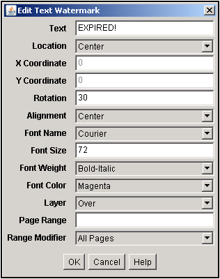
To access this screen, click the Text Watermark tab on the Add New/Edit Template Screen.
| Element | Description |
|---|---|
|
Text |
Text to appear in the watermark. The text can include embedded symbols: $PAGE$: The current page in the document. $PAGE_COUNT$: The total number of pages in the document $DATE$: The date the document is rendered. $TIME$: The time the document is rendered. $USER$: The name of requesting user. You can also include document information fields in the form $$<field_name>$$. For example, to include an expiration notice and the expiration date, specify the following: Expiration Date: $$dOutDate$$ |
|
Placement and display details |
Specify the location and appearance of the watermark:
|
|
Layer |
Places the watermark in the layer either OVER or UNDER the content. Default is OVER. |
|
Page Range and Modifier |
Pages to watermark. For example 1,2,4,10:15,19,23:LAST. Specify ranges with a colon. If left blank, all page are watermarked. Modifiers include All Pages, Odd Pages Only, Even Pages Only. |
Use this screen to specify values for an image appearing in a PDF watermark.
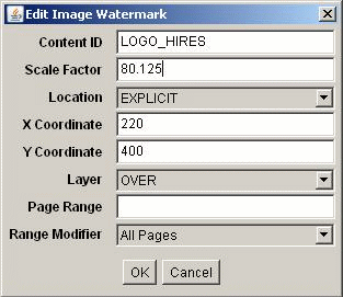
To access this screen, click the Image Watermarks tab on the Add New/Edit Template Screen.
| Element | Description |
|---|---|
|
Content ID |
The Content ID of the image used for the watermark. |
|
Scale Factor |
Factor used to scale images with resolutions other than the default 72 dpi. The Scale Factor is expressed as a percentage based on the following formula: <default dpi> / <image dpi> * 100%. For example, to maintain the size and resolution of a 300 dpi image, you calculate the Scale Factor as follows: 72 dpi / 300 dpi * 100% = 24% for a Scale Factor of 24. |
|
Location |
Location on the screen. |
|
X Coordinate |
X coordinate for placement specified in points. Each point = 1/72" from a baseline 0:0 location. |
|
Y Coordinate |
Y coordinate for placement specified in points. Each point = 1/72" from a baseline 0:0 location. |
|
Layer |
Places the watermark in the layer either OVER or UNDER the content. Default is OVER. |
|
Page Range and Modifier |
Pages to watermark. For example 1,2,4,10:15,19,23:LAST. Specify ranges with a colon. If left blank, all page are watermarked. Modifiers include All Pages, Odd Pages Only, Even Pages Only. |
Use this screen to configure a PDF watermark composed of electronic signature data. You must enable the Electronic Signature component to create a signature watermark.
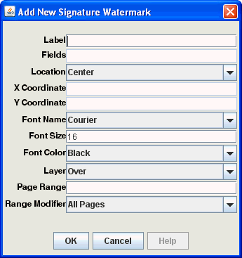
To access this screen, click the Signature Watermark tab on the Add New/Edit Template Screen.
| Element | Description |
|---|---|
|
Label |
Specify the text to identify the watermark. |
|
Fields |
Specify the electronic signature metadata fields to use in the watermark. The fields you specify here are the standard or user-defined fields from the Electronic Signatures table. Specify the fields as a comma-delimited list. |
|
Placement and display details |
Specify the location and appearance of the watermark:
|
|
Layer |
Places the watermark in the layer either OVER or UNDER the content. Default is OVER. |
|
Page Range and Modifier |
Pages to watermark. For example 1,2,4,10:15,19,23:LAST. Specify ranges with a colon. If left blank, all page are watermarked. Modifiers include All Pages, Odd Pages Only, Even Pages Only. |
This screen is used to specify default metadata field values for PDF watermarking.
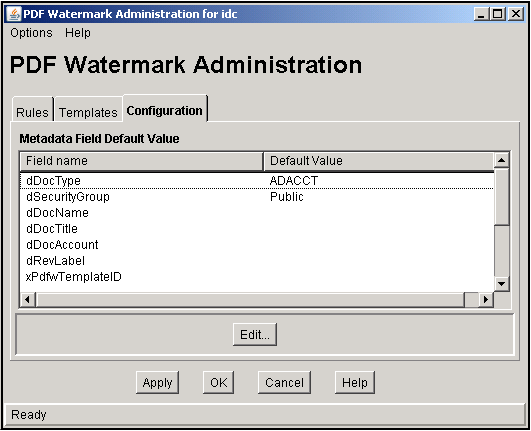
To access this screen, click Configuration on the PDF Watermark Administration Screen.
| Element | Description |
|---|---|
|
Edit |
Used to specify a value for any or all of the available metadata field default values. |
This screen is used to edit the default values of the metadata fields for checking in new templates.
To access this screen, click Edit on the Configuration Tab.
| Element | Description |
|---|---|
|
Field Name |
Name of the new or edited field. |
|
Value |
Name of the trigger value. |
This section describes the Contribution Folders administrative interface screens.
This section covers the following topics:
Section A.4.1, "Virtual Folder Administration Configuration Screen"
Section A.4.3, "System Default Information Field Configuration Page"
Section A.4.5, "Information Field Inherit Configuration Page"
This screen is used to provide access to the other Folder system configuration pages.
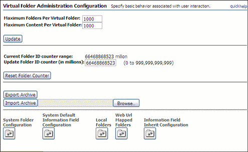
To access this screen, choose Administration then Folder Configuration from the Main menu.
| Element | Description |
|---|---|
|
Maximum Folders/Maximum Content Per Virtual Folder |
Sets the maximum number of virtual folders any user can define and number of files that any folder can contain. Click Update to apply the changes. |
|
Export Archive |
Exports the folder hierarchy as an archive file. |
|
Import Archive |
Imports the specified folder archive. Caution: When a folder archive file is imported, all current folders are removed and replaced by the imported hierarchy. Click Browse to display a list of folders for import. |
|
System Folder Configuration |
Opens the System Folder Configuration Screen. |
|
System Default Information Field Configuration |
Opens the System Default Information Field Configuration Page. |
|
Local Folders |
Opens the Local Folders Page. |
|
Information Field Inherit Configuration |
Opens the Information Field Inherit Configuration Page. |
This screen is used to enable and disable system-level contribution folders.
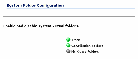
To access this page, do either of the following:
Choose Administration then Folder Configuration from the Main menu. Choose System Folder Configuration.
Click System Folder Configuration on the Virtual Folder Administration Configuration Screen.
| Element | Description |
|---|---|
|
Enabled/Disabled icon |
Click an icon to enable or disable the folder. |
This page is used to set system default metadata for contribution folders.
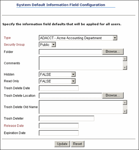
To access this page, do either of the following:
Choose Administration then Folder Configuration from the Main menu. Choose System Default Information Field Configuration.
Click System Default Information Field Configuration on the Virtual Folder Administration Configuration Screen.
| Element | Description |
|---|---|
|
Information fields |
Defines the metadata values applied to content checked in through a contribution folder if values are not defined for the folder or by the user. The values are applied on initial check-in. You can use Idoc Script. If Release Date is not specified, the current date and time is used. |
This page is used to map a contribution folder structure to a local file system.
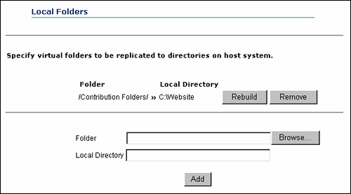
To access this page, do either of the following:
Choose Administration then Folder Configuration from the Main menu. Choose Local Folders.
Click Local Folders on the Virtual Folder Administration Configuration Screen.
| Element | Description |
|---|---|
|
Rebuild |
Deletes the existing local directory structure and re-creates the folder structure. Any subdirectories and files are deleted then re-copied to the local directory. |
|
Remove |
Removes the local directory from the file system. |
|
Folder |
Contribution folder to be mapped to a local directory. Click Browse to select a folder to be mapped. |
|
Local Directory |
Directory where the folder structure is replicated. |
|
Add |
Replicates the folder to a specified directory on the file system. |
This page is used to select which metadata values are propagated from a contribution folder to its subfolders and content items.
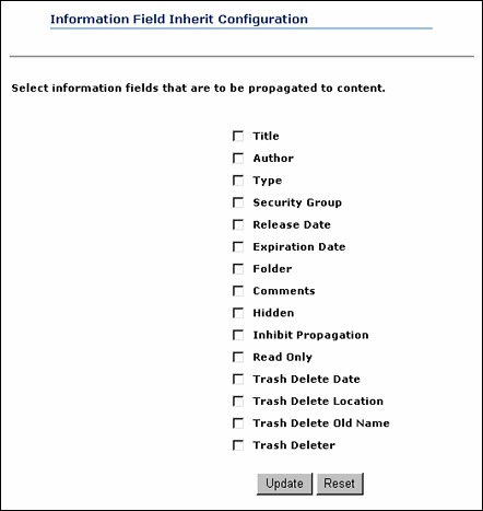
To access this page, do either of the following:
Choose Administration then Folder Configuration from the Main menu. Choose Information Field Inherit Configuration.
Click Information Field Inherit Configuration on the Virtual Folder Administration Configuration Screen.
| Element | Description |
|---|---|
|
Information Field check boxes |
Selects the metadata fields to be propagated. |
This page is used to create template with a predefined structure that users select when they create an advanced folio. It is made up of two tabs:
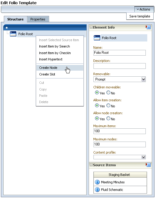
To access this screen, choose Administration then Folio Administration from the Main menu. Select Create Folio Template.
The Structure tab is divided into the following sections:
This pane is used to define the objects that compose the folio hierarchy.
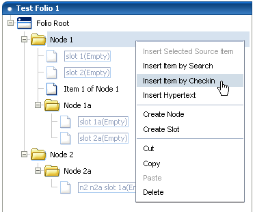
This pane is part of the Create/Edit Folio Template Page. Unless otherwise noted, information is applicable to all elements (nodes, items, slots).
| Item | Description |
|---|---|
|
Insert Selected Source Item |
Inserts the selected item from the Source Items Pane. |
|
Insert Item by Search |
Opens a window to search for an item to add to the node or slot. |
|
Insert Item by Checkin |
Opens a window with a content check-in form used to check in an item for use in the selected node or slot. |
|
Remove Content Item |
(item only) Removes a content item from a slot. |
|
Insert Hypertext |
Creates a new item in the folio structure that can establish a hypertext link to the specified URL. |
|
Create Node or Slot |
Creates a new node or slot in the folio structure. |
|
Cut, Copy, Paste |
Cuts an object from the structure for copying or pasting. |
|
Delete |
Deletes an object. |
Use this pane to define the details of each element of the XML template file checked in to define the folio.
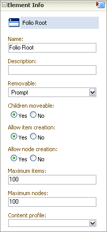
This pane is part of the Create/Edit Folio Template Page. Fields are displayed for all elements (items, slots, and nodes) unless otherwise noted.
Important:
The element information is unique to the folio template, not to the content item associated with the template. A content item can be associated with several different folio templates, and the element information about that item can be different in each template. If the element information is changed in one template, it does not change in another.
| Information | Description |
|---|---|
|
Name |
Name given the element. |
|
Description |
Description of the element to help identify its intended use. |
|
Attributes (slots and items) |
Allowable uses and limitations of an element. Options include:
|
|
Attributes (nodes) |
Default attributes for nodes. Options include:
|
|
Content ID |
(items and slots) Unique identifier of a content item. |
|
Create Date |
(items and slots) Date a content item was created. |
|
last modified |
(items and slots) Date changes were made to the item. |
|
link |
(hyperlinks only) URL of the hyperlink. |
This screen is used to define the default folio template properties and enable a folio template.
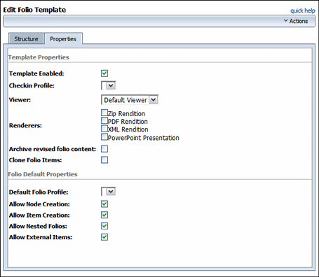
To access this screen, click the Properties tab on the Create/Edit Folio Template Page.
| Form Element | Description |
|---|---|
|
Template Enabled |
If selected, enables the template for the user when creating an advanced folio. |
|
Checkin Profile |
Specifies the profile to be used when a user checks in a newly created folio based on this template. Choosing a profile here suppresses the option for the user to select one on check in. |
|
Viewer |
Specifies the viewer to use for the View Folio page. |
|
Renderers |
Specifies what options are available in the Renderers menu on the Edit Folio page. Options are:
|
|
Archive revised folio content |
If selected, causes the current revisions of folio content to be compressed into a flat file and stored as the native file of the folio revision each time it is locked or a snapshot is made. Default: disabled. |
|
Clone Folio Items |
If selected, causes any content items specified in the template to be cloned when a folio is created from the template. Cloning an item creates a copy and checks it in as a new content item. If this is not enabled, any content item specified in the template is associated with the folio using the existing content ID. |
| Form Element | Description |
|---|---|
|
Default Folio Profile |
Specifies the profile to be used for searching and checking in when adding content items to the folio. |
|
Allow Node Creation |
If selected, you can create nodes. |
|
Allow Item Creation |
If selected, you can create items. |
|
Allow Nested Folios |
If selected, you can add other folios as an item to the folio. |
|
Allow External Items |
If selected, you can add external links to the folio. |
This section describes the Content Tracker interface screens.
This section covers the following topics:
This screen provides access to the user-controlled functions of the Content Tracker Data Engine.
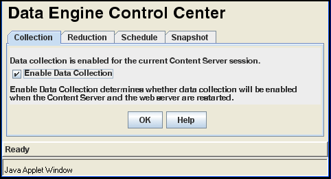
To access this screen, choose Administration then Content Tracker Administration from the Main menu. Click Data Engine Control Center.
This section describes the following tabs accessible through this page:
This screen is used to enable Web traffic data collection for a session.

To access this screen, click the Collection tab on the Data Engine Control Center.
| Element | Description |
|---|---|
|
Enable Data Collection |
If selected, enables data collection. Oracle WebCenter Content Server and the Web server must be restarted before any changes take effect. |
This screen is used to start and stop data reduction manually, to monitor progress of a data reduction operation, and to delete the raw data files from which the table rows are generated.
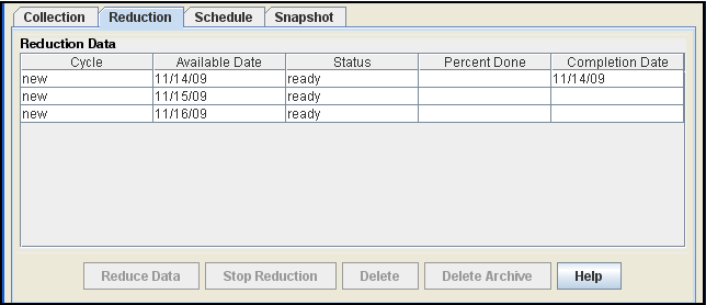
To access this screen, click the Reduction tab on the Data Engine Control Center.
This screen is used to enable automatic data reduction.

To access this screen, click the Schedule tab on the Data Engine Control Center.
| Element | Description |
|---|---|
|
Scheduling Enabled |
If selected, data reduction runs automatically. |
|
Days to Run |
If selected, data reduction runs on the days chosen. |
|
Time to Run |
Used to select the hour and minute when data reduction runs. |
This screen is used to selectively enable and automatically assign specific activity metrics to pre-defined, custom metadata fields.

To access this screen, click the Snapshot tab on the Data Engine Control Center.
All fields are case-sensitive. Make sure all field values are spelled and capitalized correctly.
This screen is used to log additional service calls with data values relevant to the associated services.
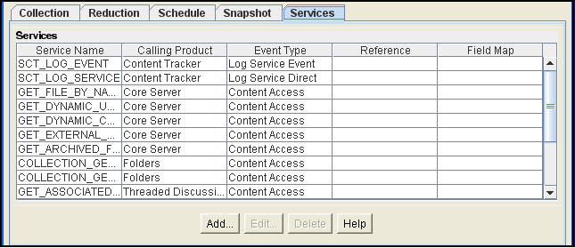
To access this screen, click the Services tab on the Data Engine Control Center.
This tab is not displayed if Content Access Only mode is set to ON (the default).
| Element | Description |
|---|---|
|
Services |
Names and result set values of services logged by Content Tracker. |
|
Add or Edit |
Opens the Extended Services Tracking Screen. |
|
Delete |
Deletes the selected service. |
This screen is used to configure service entries in the ServiceExtraInfo ResultSet that is included in the SctServiceHandler.hda file.
To access this screen, click Add on the Services Tab.
This screen is used to configure the field map ResultSets linked to the service entries and included in the SctServiceHandler.hda file.
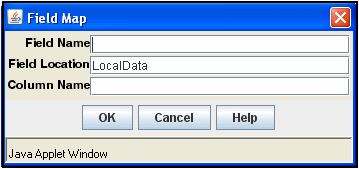
To access this screen, click Add on the Extended Services Tracking Screen.
You can set the SctDebugServiceBinderDumpEnable configuration variable to configure the service handler filter to write out the service DataBinder objects into dump files. See the Oracle WebCenter Content Idoc Script Reference Guide for details.
This screen is used to select a pre-defined report.
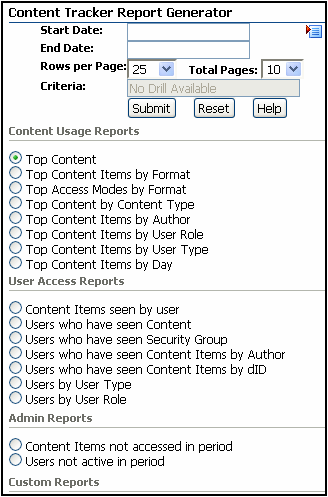
To access this screen, choose Administration then Content Tracker Reports from the Main menu.
| Field | Description |
|---|---|
|
Date fields and menu |
Start and end of a specific time period for records to be searched. Use the date menu to enter relative dates in the field(s):
|
|
Rows per Page |
Specifies the number of results rows for each page of the report. |
|
Total Pages |
Specifies the maximum number of results pages for the report. |
|
Criteria |
Filters the search results and immediately accesses the applicable drill-down report. |
|
Content and User |
Lists content and user according to the selected criteria. |
This section describes the Content Categorizer interface screens.
This section covers the following topics:
This screen is used to define the configuration and search rules for Content Categorizer, register categorizer engines, and build query trees.
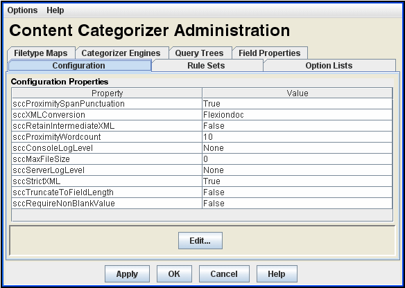
To access this screen, choose Administration then Content Categorizer Administration from the Main menu.
| Element | Description |
|---|---|
|
Options menu |
Provides options to save changes or exit the application. |
|
Tabs |
The individual tabs are used to manage the software: |
This screen is used to set Content Categorizer run-time configuration settings.

To access this screen, click the Configuration tab on the Content Categorizer Administration Page.
| Element | Description |
|---|---|
|
Property |
Lists properties that can be configured:
|
|
Value |
Current value for each property. |
|
Edit |
Opens the Field Map Screen for a selected property. |
This screen is used to edit the value of the property.
To access this screen, highlight a property on the Configuration Tab and click Edit.
| Element | Description |
|---|---|
|
Property field |
Changes the setting of the selected property. |
This screen is used to define the search rules that Content Categorizer uses to find metadata values.
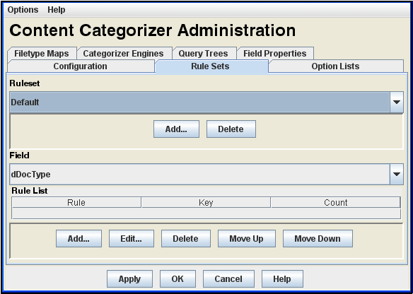
To access this screen, click the Rule Sets tab on the Content Categorizer Administration Page.
| Element | Description |
|---|---|
|
Ruleset list |
Defined search rulesets. You cannot include one ruleset in another and you can apply only one ruleset to a given document. |
|
Add (Ruleset) |
Opens the Add Ruleset Screen. |
|
Delete (Ruleset) |
Deletes the selected search ruleset. You cannot delete the default ruleset. |
|
Field list |
Selects a metadata field for viewing or defining search rules. Only the metadata fields that allow search rules are included in the list. |
|
Rule List |
Defined search rules for the metadata field. Searches are run in the order shown, from the top of the list to the bottom. |
|
Columns |
Shows the type of search rule, the search key, and the count. |
|
Edit (Rule List) |
Opens the Add/Edit Rule for Field Screen. |
|
Delete (Rule List) |
Deletes the selected search rule. |
|
Move Up/Down (Rule List) |
Moves the selected search rule up or down in the list. |
This screen is used to define a new search ruleset.
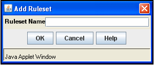
To access this screen, click Add on the Content Categorizer Administration Page.
Important:
Content Categorizer requires a non-empty rule set for any file type (.doc, .txt, .xml, and so on) it is called to examine. If no rules exist for a given file type, Content Categorizer throws an exception.The easiest way to protect against this is to add at least one rule to the Default rule set. The Default rule set is used for all file types which do not have a custom rule set assigned.
| Element | Description |
|---|---|
|
Ruleset Name |
Used to add a ruleset name. |
This screen is used to define a new search rule or edit a rule.
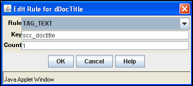
To access this screen, click Add or Edit on the Rule Sets Tab.
| Element | Description |
|---|---|
|
Rule list |
Selects the type of search rule. |
|
Key |
Defines the search key for the search rule. |
|
Count |
Defines the count for the search rule. |
This screen is used to define the keywords and weights for search rules.
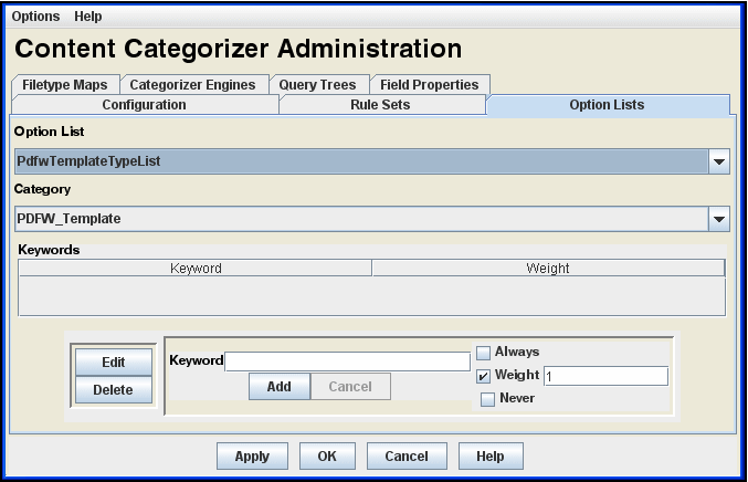
To access this screen, click the Option Lists tab on the Content Categorizer Administration Page.
| Element | Description |
|---|---|
|
Option List |
Selects the list. |
|
Category |
Selects a value on the selected list. |
|
Keyword |
Keywords associated with the selected category and their weight. |
|
Edit |
Changes the Add button to Update and enters the selected keyword and weight in the editing area. |
|
Delete |
Deletes the selected keyword. |
|
Keyword box |
Used to add or edit a keyword. Click Add to add the keyboard and weight value or apply changes to the selected keyword. |
|
Cancel |
Changes the Update button to Add without saving changes to the selected keyword and weight value. |
|
Weight options |
Defines the weight assigned to the keyword. |
This screen is used to create and modify a filetype map.
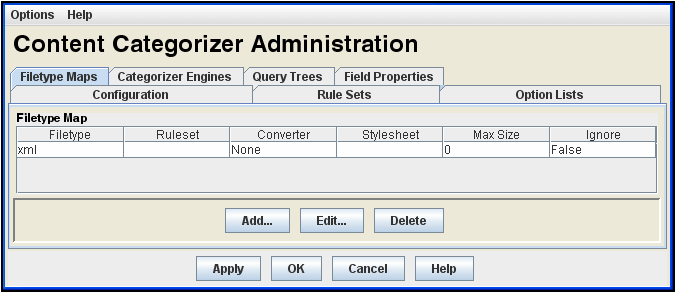
To access this screen, click the Filetype Maps tab on the Content Categorizer Administration Page. If no Filetype Map entry is defined for a particular content item, then the default ruleset, XML Converter, style sheet, and maximum size values are used.
| Element | Description |
|---|---|
|
Filetype Map |
Defined filetype maps and their properties, including:
|
|
Add or Edit |
Opens the Add/Edit Filetype Map Screen. |
|
Delete |
Deletes the selected filetype map. |
This screen is used to define a new filetype map or edit a map.
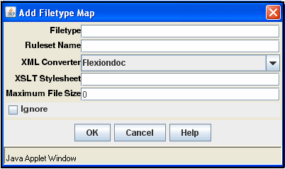
To access this screen, click Add or Edit on the Filetype Maps Tab.
Defining a filetype entry for a particular content file type allows content-specific processing alternatives. For example, you could use a custom ruleset for a specific content type, set a maximum file size, or direct Content Categorizer to ignore files.
| Element | Description |
|---|---|
|
Filetype |
Specifies the filetype (such as doc, txt, xls). Enter $$NONE$$ to define a map entry for files with no filetype. |
|
Ruleset Name |
Used to specify the ruleset to be applied. If no ruleset is specified, the default ruleset are used. |
|
XML Converter |
Lists the applicable XML converter. Three values are available: Flexiondoc, SearchML, and None. (None is available if the content is in XML format either currently or when the custom XSLT style sheet completes its processing.) The default value is set as a configuration parameter. |
|
XSLT Stylesheet |
Used to specify the file path (absolute or relative) of the XSLT style sheet to be applied. XSLT style sheets are stored in the IntradocDir/custom/ContentCategorizer/stylesheets/ directory. You can use customized, content-specific XSLT translation style sheets as the back-end of the XML conversion. The selected steeliest is used in a transformation operation after the XML conversion (if any) is complete. Style sheets allow document properties and content to be isolated with he results extracted to a metadata field. The style sheet to be used for a given content item is determined by a set of specifiers that includes the document type (doc, txt, xls, and so on). The default value for XSLT Stylesheet depends on the XML converter actually used. Flexiondoc uses flexion_to_scc.xsl and SearchML uses searchml_to_scc.xsl. |
|
Maximum File Size |
Used to establish the maximum file size for a given file type (doc, txt, xls, and so on). Files of this type that exceed the maximum size are ignored by Content Categorizer. |
|
Ignore |
If selected, directs Content Categorizer to disregard a particular file type (doc, txt, xls, and so on). |
This screen is used to register a third-party categorization engine for integration with Content Categorizer.
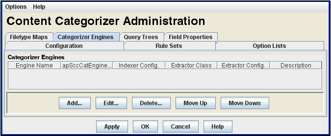
To access this screen, click the Categorizer Engines tab on the Content Categorizer Administration Page. The values needed to register an engine are normally provided by the third-party categorization vendor.
| Element | Description |
|---|---|
|
Categorizer Engines |
Defined Categorizer Engines. |
|
Properties |
Shows the following properties for a Categorizer Engine:
|
|
Add or Edit |
Displays the Add/Edit Categorizer Engine Screen. |
|
Delete |
Deletes the registration for the selected engine. |
|
Move Up/Down |
Moves the position of the selected engine in the list. |
This screen is used to add a categorizer engine.
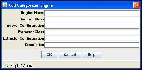
To access this screen, click Add on the Categorizer Engines Tab.
| Element | Description |
|---|---|
|
Engine Name |
Identifier for a categorization engine for which SCC has an adaptor module. This identifier is used in the Key field of a CATEGORY rule, for example, "EngineName/TaxonomyName". |
|
Indexer Class |
Name of the Java class in an SCC adaptor module used to ask the categorizer engine to categorize document(s). |
|
Indexer Configuration |
String passed to the Indexer Class's |
|
Extractor Class |
Name of the Java class in an SCC adaptor module used to ask the categorizer engine for the set of categories in a given taxonomy. |
|
Extractor Configuration |
String passed to the Extractor Class's |
|
Description |
Description of the categorization engine. |
This screen is used to create a browsable hierarchy of categorized documents.
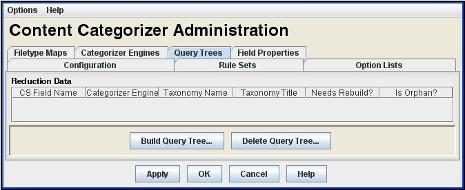
To access this screen, click the Query Trees tab on the Content Categorizer Administration Page.
| Element | Description |
|---|---|
|
Query Trees |
Defined Query Trees. |
|
Properties |
Shows the following properties and status for a Query Tree:
|
|
Build Query Tree |
Displays the Build Query Tree Screen. |
|
Delete Query Tree |
Displays the Delete Query Tree Screen. |
This screen is used to build a query tree.
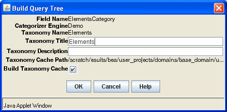
To access this screen, click Build Query Tree on the Query Trees Tab.
| Element | Description |
|---|---|
|
Field Name |
Metadata field for which the CATEGORY search rule was defined. |
|
Categorizer Engine |
Categorizer engine specified for the CATEGORY search rule that was defined for the metadata field. |
|
Taxonomy Name |
Taxonomy specified for the CATEGORY search rule that was defined for the metadata field. |
|
Taxonomy Title |
Title of taxonomy. |
|
Taxonomy Description |
Description of taxonomy, which is used under the root link on the Library main page and in the Description field of the Query Link Definition screen. |
|
Taxonomy Cache Path |
Path to the taxonomy cache: IntradocDir/data/contentcategorizer/taxonomies/engine_name/taxonomy_name/ |
|
Build Taxonomy Cache |
If selected, click OK to build or rebuild the taxonomy cache. |
This screen is used to delete a query tree.
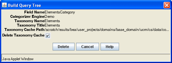
To access this screen, click Delete Query Tree on the Query Trees Tab. For details about the fields on this screen, see Section A.7.7.1, "Build Query Tree Screen."
This screen is used to set override and default properties used during Batch mode.
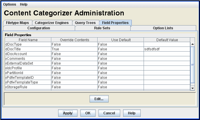
To access this screen, click the Field Properties tab on the Content Categorizer Administration Page.
| Element | Description |
|---|---|
|
Field Properties |
Standard and custom metadata fields and their property settings including:
|
|
Edit |
Opens the Field Properties Screen. |
This screen is used to edit settings for a field selected in the Field Properties list.
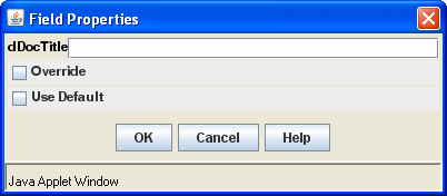
To access this screen, click Edit on the Field Properties Tab.
| Element | Description |
|---|---|
|
Metadata field |
Used to change the default value of the selected field. |
|
Override |
If selected, sets Override to true. |
|
Use Default |
If selected, sets Use Default to true. |
This screen is used to run Content Categorizer in Batch mode.
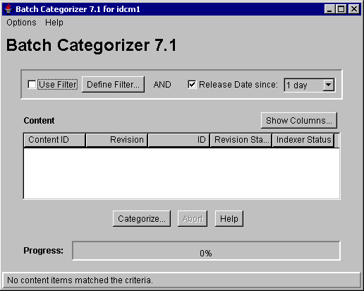
To access this screen, run the BatchCategorizer application.
| Element | Description |
|---|---|
|
Use Filter and Release Date |
If selected, enables filtering of content based on any defined filters and release date filter (if specified). |
|
Define Filter |
Opens the Define Filter Screen. |
|
Content list |
Content items in the repository. |
|
Show Columns |
Opens the Show Columns Screen. |
|
Content list properties |
Shows properties for each content item such as Content ID, Revision, and so on. |
|
Categorize |
Opens the Categorize Existing Screen. |
|
Progress bar |
Shows the progress of the batch process. |
This screen is used to categorize existing content.
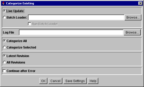
To access this screen, click Categorize on the Batch Categorizer Screen.
| Element | Description |
|---|---|
|
Live Update or Batch Loader |
If selected:
|
|
Run Batch Loader |
If selected, runs the utility. |
|
Log File |
Defines the location and file name for the Categorizer log file. Click Browse to select a location. |
|
Categorize options |
|
|
Revision options |
|
|
Continue after Error |
If selected, the Batch Categorizer continues processing when it encounters an error and logs the error. Otherwise, processing stops when an error is encountered. |
This section describes the screens used to create Web pages with the Web Layout Editor.
This section covers the following topics:
The following screens are used to create and edit queries through the Web Layout Editor.
This page is used to design a Web layout.
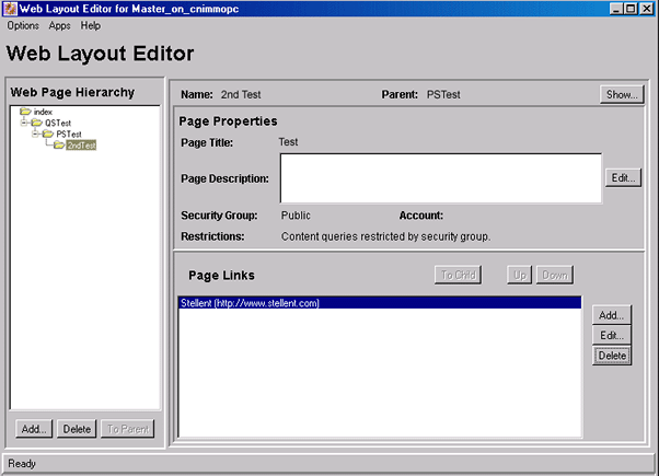
To access this page, choose Administration then Admin Applets from the Main menu. Click Web Layout Editor.
This page contains three panes: the Web Page Hierarchy pane, the Page Properties pane, and the lower page (usually the Page Links pane).
| Element | Description |
|---|---|
|
Opens the Web site structure and relationship between pages. |
|
|
Defines the page header text and the security group that filters the content for the page. |
|
|
Lower pane |
Determines what is displayed in the lower pane:
|
This pane displays the organization of the local Web pages in the Library. Child pages are shown in the parent's folder. A page must be selected in this pane to edit it.
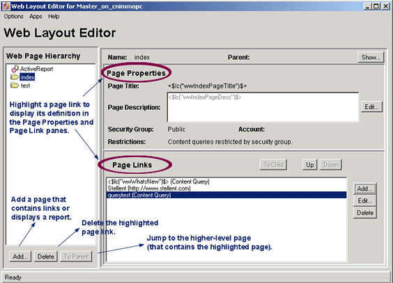
For subadministrators to see a page in this pane, they must be able to view its parent. For subadministrators to delete a page, the page must be a directory page and the subadministrator must have access to that page and all of its children.
| Element | Description |
|---|---|
|
Add |
Adds a page that contains links or opens a report. |
|
Delete |
Deletes the highlighted page link. |
|
To Parent |
Jumps to the higher-level page containing the highlighted paged. |
This pane controls page header text and the security group that filters its content.
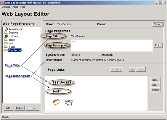
For subadministrators to edit a page, it must be a directory page, and the subadministrator must have admin access to that page and all of its children. This prevents a subadministrator from editing a public page that has links to secure pages.
| Element | Description |
|---|---|
|
Name |
Page name as it appears in the Web Page Hierarchy pane. |
|
Parent |
Parent page, if the page has a parent. |
|
Show |
Opens the Web page. |
|
Page Title |
Title of the Web page. |
|
Page Description |
Description of the Web page. |
|
Security Group |
Names of the security groups that filter the files appearing on the Web page. Only files within the security group for which end user has permission are displayed. |
|
Account |
Assigns the account to the page. Only users with Read permission to the account can access this page. |
|
Restrictions |
Shows any restrictions, such as whether content queries are restricted by security group or account. |
This pane opens the contents of the local page selected in the Web Page Hierarchy Pane.
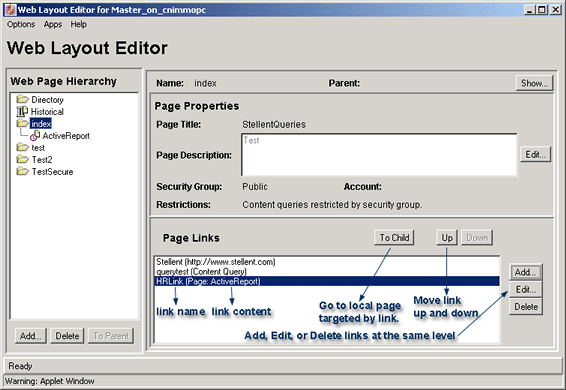
For subadministrators to see the contents of a page, they must have Read access to that page and all of its parents. This prevents the subadministrators from seeing a page that they cannot get to through the Library link.
| Element | Description |
|---|---|
|
To Child |
Goes to the local page targeted by the link selected in the Page Links pane. |
|
Up or Down |
Moves the selected link up or down in the list of links. |
|
Lower pane |
The page selected in the Web Page Hierarchy pane determines what is displayed in the lower pane:
|
|
Add |
Opens the Add Page Link Screen. |
|
Edit |
Displays the relevant screen for editing a link at the same level. For example, when editing a query, a Query Link Definition page opens, or when editing a URL, an Edit URL page opens. |
|
Delete |
Deletes the selected link at the same level. |
This screen is used to start the process of setting up a link to a new Web page.
To access this screen, click Add on the Page Links Pane.
| Element | Description |
|---|---|
|
Link Type |
Specifies which type of page link to add to the Web page:
|
This screen is used to add a new Web page.
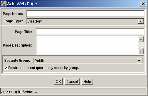
To access this screen, click Add on the Web Page Hierarchy Pane.
| Element | Description |
|---|---|
|
Page Name |
Name appearing in the Web Page Hierarchy pane. |
|
Page Type list |
|
|
Page Title and Page Description |
Appear on the Page Properties Pane. |
|
Security Group |
Filters the files that appear on the Web page. Only files within the security group for which an end user has permission are displayed. |
|
Restrict content queries by security group |
If selected, the security group applies to all queries that originate from this page. All queries inherit the security group of this page. |
|
Account |
Assigns the account to the page. Only users with Read permission to the account can access this page. |
|
Restrict content queries by account |
If selected, the account applies to all queries that originate from this page. |
This screen is used to enter information about a local page.
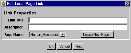
To access this screen, click Add then Local Page in the Web Page Hierarchy Pane of the Page Links Pane.
| Element | Description |
|---|---|
|
Link Title |
Text displayed as the link. |
|
Description |
Optional field text or HTML displayed under the link to provide additional description about the destination. |
|
Page Name |
The page where the link appears. |
|
Create New Page |
Opens the Add Web Page Screen. |
This screen is used to specify information for an external URL.
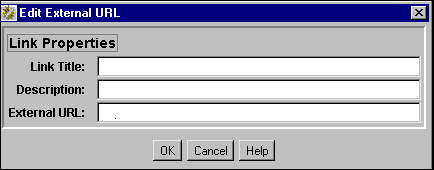
To access this screen, click Add then External URL from the Page Links Pane in the Web Page Hierarchy Pane.
| Element | Description |
|---|---|
|
Link Title |
Text displayed as the link. |
|
Description |
Optional field text or HTML displayed under the link to provide additional description about the destination. |
|
External URL |
Address of the link's destination, starting with |
This screen is used to modify the page properties for a Web page.
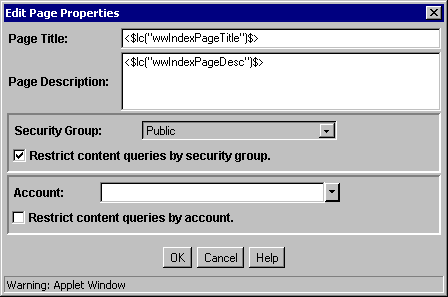
To access this page, select a page in the Web Page Hierarchy Pane then click Edit in the Page Properties Pane.
| Element | Description |
|---|---|
|
Page Title |
Title of the Web page. |
|
Page Description |
Describes the Web page. |
|
Security Group |
Specifies the security group for the Web page. |
|
Restrict content queries by security group |
If selected, content queries are restricted to users assigned to the specified security group. |
|
Account |
Assigns the account to the Web page. Only users with Read permission to the account can access this page. |
|
Restrict content queries by account |
If selected, content queries are restricted to users assigned to the specified account. |
This screen is used to define the data source, template, and query definition for an active report.
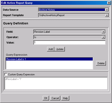
To access this screen, select an active report page in the Web Page Hierarchy Pane and click Edit Report Query in the Active Report Specification pane.
| Element | Description |
|---|---|
|
Data Source |
Type of report to create:
|
|
Report Template |
List of templates that control the query links display. |
| Query Definition pane | Description |
|---|---|
|
Field |
Field the query searches, dependent on the Data Source selected. |
|
Operator |
Query operators. Available operators are the result of the field selected. |
|
Value |
Target data for the query, dependent on the Field selected. |
|
Add |
Enters the query into the Query Expression box. You can append one or more query lines |
|
Update |
Updates the selected query line. |
|
Query Expression |
Displays each query as a single line when added by the Add button. |
|
Custom Query Expression |
If selected, enables display and editing of SQL code generated from the query expression. If unselected, the expression reverts to its original definition and modifications are lost. |
|
Delete |
Deletes a selected query line. |
This screen is used to specify the information to be included in an historical report.
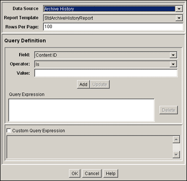
To access this screen add a new Web page and specify that it be a historical report. When Historical Report Specification is shown in the lower pane of the Web Layout Editor, click Create Report Data.
| Element | Description |
|---|---|
|
Data Source |
Select Archive History from the list of data sources. |
|
Report Template |
This field is automatically populated with the tdArchiveHistoryReport selection. |
|
Rows Per Page |
The rows per page in the report. |
|
Field |
Metadata field the query searches. |
|
Operator |
The method for searching the metadata fields. The selected field determines the set of available values:
|
|
Value |
Target data for the query. |
|
Add |
Enters the query into the Query Expression box. You can append one or more query lines. |
|
Update |
Updates the selected query line. |
|
Query Expression box |
Displays each query as a single line. |
|
Delete |
Deletes the selected query line. |
|
Custom Query Expression |
If selected, enables display and edit of Idoc Script generated from the query expression. If unselected, the expression reverts to its original definition and modifications are lost. |
This screen is used to specify the information to be used in a query.
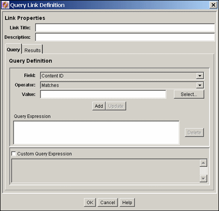
To access this screen click Add or Edit in the Web Layout Editor Page.
| Element | Description |
|---|---|
|
Link Title |
Text displayed as the link. |
|
Description |
Text displayed under the link to provide a description about the link destination (optional field). |
| Query Tab | Description |
|---|---|
|
Field |
Metadata field the query searches. |
|
Operator |
Specifies the method for searching the metadata fields. The selected field determines the set of available values. |
|
Value |
Target data for the query. |
|
Select |
Opens the Content Item View screen or User View screen, used to select content items or users. |
|
Add |
Enters the query into the Query Expression box. You can append one or more query lines. |
|
Update |
Updates the selected query line. |
|
Query Expression pane |
Displays each query as a single line. |
|
Delete |
Deletes the selected query line. |
|
Custom Query Expression |
If selected, enables display and edit of Idoc Script generated from the query expression. If unselected, the expression reverts to its original definition and all modifications are lost. |
Note:
You can directly edit the following fields to add Idoc Script variables and HTML tags.
| Results Tab | Description |
|---|---|
|
Page Title |
Heading of the query results page. |
|
Sort Results By |
The metadata field by which the list of results is sorted. |
|
Sort Order |
The order of search results. |
|
Results Template Page |
Templates that control how the query links are displayed. The list contains a Standard Results page and any templates created with the Query Results Pages screen. |
|
Use Customized Text |
If selected, displays custom text for each row on the query results page. |
|
Text 1, Text 2 |
Text that is displayed as the first or second line in each row on the query results page.* |
|
Arrows |
Moves the selected field from the Field list to the Text 1 or Text 2 field. |
|
Field list |
Lists the metadata fields available for display on the query results page. |
This page is used to add or edit specifications for query results.
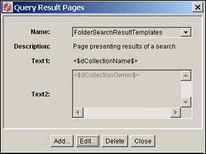
To access this screen select Options then Query Result Pages from the Web Layout Editor Page.
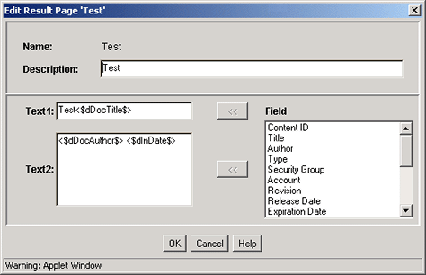
To add a query result page, click Add on the Add/Edit Query Results Page.
Note:
You can edit these fields directly to add Idoc Script variables and HTML tags.
| Element | Description |
|---|---|
|
Name |
The name for the Query Results Page. You can select this name from the Results Template Page Properties. |
|
Description |
Helps identify the results page. This text is not displayed on a Web page. |
|
Text 1, Text 2 field |
Text that is displayed as the first or second line in each row on the query results page. |
|
Arrows |
Moves the selected field from the Field list to the Text 1 or Text 2 field. |
|
Field |
Lists the metadata fields available for display on the query results page. |
When adding Idoc Script variables and HTML tags to the Text 1 and Text 2 fields, keep in mind that any resulting HTML tags can affect the display of the search results page. See the Oracle WebCenter Content Idoc Script Reference Guide for more information.