| Name |
Description |
Sample Image |
| <af:activeCommandToolbarButton> |
The activeCommandToolbarButton creates a button in a toolbar. It is normally used inside of a <af:toolbar> component. activeCommandToolbarButtons are not rendered on printable pages. |
 |
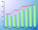
| <af:activeImage> |
The activeImage component renders an image specified by the source property and supports changing this property through active data. |
 |
| <af:activeOutputText> |
The activeOutputText component supports styled text and changing of this text through active data. The text can optionally be left unescaped. Unlike OutputText, conversion to and from Java objects is not supported. |
 |
| <af:breadCrumbs> |
A breadCrumbs component is used in hierarchical site layouts to indicate the path back to the root page of the hierarchy with links. |
 |
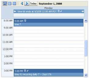
| <af:calendar> |
The calendar component provides the ability to view activities in a calendar. |
 |
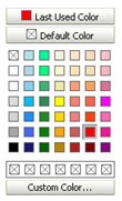
| <af:chooseColor> |
The chooseColor component is used in conjunction with an inputColor to allow the user to quickly select a color value without having to navigate to a secondary window. |
 |
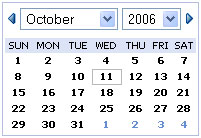
| <af:chooseDate> |
The chooseDate component is used in conjunction with an inputDate to allow the user to quickly select a date value without having to navigate to a secondary window. |
 |
| <af:column> |
Component that is used as a child of the Table component. The Column component defines the header, footer and data for a single column in the Table. |
No image |
| <af:commandButton> |
The commandButton component creates a button that, when pressed, will generate an action event on the server. The button can contain text, an image, or text and an image. |
 |
| <af:commandImageLink> |
The commandImageLink component creates a link that has icon support, and when pressed will generate an action event on the server. |
 |
| <af:commandLink> |
The commandLink component creates a link that, when pressed, will generate an action event on the server. |
 |
| <af:commandMenuItem> |
The commandMenuItem component creates a menu item representation that, when pressed, will generate an action event on the server. |
 |
| <af:commandNavigationItem> |
The commandNavigationItem control creates a a navigation item representation of a UIXCommand. The item could be rendered as a link, an option, a button, etc. |
 |
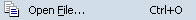
| <af:commandToolbarButton> |
The commandToolbarButton creates a button in a toolbar. It is normally used inside of a toolbar component. |
|
| <af:declarativeComponent> |
Adds a dynamic declarative component to the page. Dynamic declarative components allow the UI definition of a component to be defined in terms of a composition of other components and then treated as a single component. |
No image |
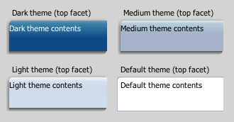
| <af:decorativeBox> |
The decorativeBox component stretches the child in the center facet to fill all of the available space. It is bordered by eight styled areas. The top bordered area may contain stretched content from the top facet such as navigationPane tabs. |
 |
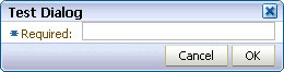
| <af:dialog> |
The dialog control is a layout element that displays its children inside a dialog window and delivers DialogEvents when the OK and Cancel actions are activated. |
 |
| <af:document> |
The document tag creates each of the standard root elements of an HTML page: <html>, <body>, and <head>. |
No image |
| <af:form> |
The form tag creates an HTML <form> element. |
No image |
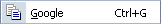
| <af:goButton> |
The goButton creates a push button that navigates directly to another location instead of delivering an action. |
 |
| <af:goLink> |
The goLink tag is an HTML link. |
 |
| <af:goMenuItem> |
The goMenuItem component creates a menu item representation that navigates directly to another location instead of delivering an action. |
 |
| <af:group> |
The group component is an invisible control that aggregates semantically-related children. |
No image |
| <af:icon> |
Renders an icon. |
 |
| <af:image> |
The image control creates an image tag. |
|
| <af:inlineFrame> |
The inlineFrame component is used to create an Inline Frame tag. |
 |
| <af:inputColor> |
Renders an input field for colors. The field can be tied to a ChooseColor element for easy color picking. |
 |
| <af:inputComboboxListOfValues> |
Used for selecting and returning data for fields in the main page. |
 |
| <af:inputDate> |
Renders an input field for dates. The field can be tied to a ChooseDate element for easy date picking. |
 |
| <af:inputFile> |
The inputFile component is a component that can be used to upload a file. It supports displaying a label, text, and messages. |
 |
| <af:inputListOfValues> |
LOV input control |
 |
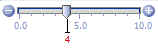
| <af:inputNumberSlider> |
Represents an input slider component with a single value. |
 |
| <af:inputNumberSpinbox> |
Creates a browser input widget; it is used to enter numbers and it has a spinbox to quickly increment or decrement the number. |
 |
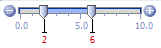
| <af:inputRangeSlider> |
Represents an input slider component with dual values. |
 |
| <af:inputText> |
An input text field control. |
 |
| <af:iterator> |
UIXIterator is a component that does iteration. It is similar to UIXTable but has no chrome. |
No image |
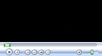
| <af:media> |
The media component displays media content, such as audio, video, or image in a player embedded in the user agent. |
 |
| <af:menu> |
Represents a vertical menu component. Typically, this is used as a child of a menuBar or popup. |
 |
| <af:menuBar> |
Represents a MenuBar component. Its children are menu components. |
 |
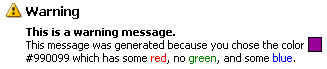
| <af:message> |
Component that displays a message on behalf of a component. ADF input components typically support automatically showing their own messages, so this tag should be used only when setting the "simple" attribute to true. |
 |
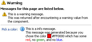
| <af:messages> |
The messages tag displays important page-level messaging information to the user. |
 |
| <af:navigationPane> |
The navigationPane component creates a series of navigation items representing one level in a navigation hierarchy. |
 |
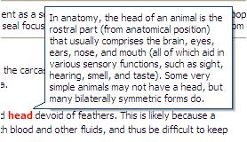
| <af:noteWindow> |
A note window is a floating panel that contains read-only information associated with a particular UI component. |
 |
| <af:outputFormatted> |
The outputFormatted bean accepts a string in its "value" attribute containing a very limited set of HTML markup and outputs formatted results. |
 |
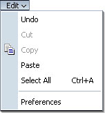
| <af:outputLabel> |
Component that displays a label for a form component. |
 |
| <af:outputText> |
The outputText component supports styled text. |
|
| <af:pageTemplate> |
Page Templates provide a re-usable page definition that allows the application developer to provide consistent branding, and page layout across the application. |
 |
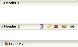
| <af:panelAccordion> |
The panelAccordion control creates, contains, and shows a series of items defined by showDetailItem nodes. |
 |
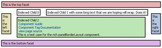
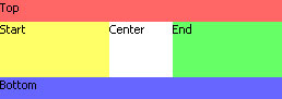
| <af:panelBorderLayout> |
The panelBorderLayout component is a layout element which lays out all of its children consecutively in its middle. |
 |
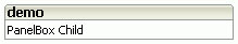
| <af:panelBox> |
The Box Panel is used to place ancillary information on a page, offset by a certain color |
 |
| <af:panelCollection> |
A panel component that aggregates collection components like table, treeTable and tree to display standard/application menus, toolbars and statusbar items. |
 |
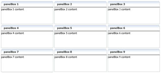
| <af:panelDashboard> |
The panelDashboard component arranges children into a grid of columns and rows. It will attempt to stretch its children to fill up the width of a column and the specified row height. |
 |
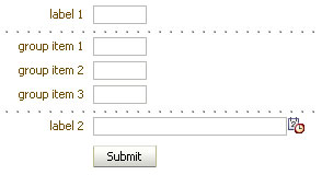
| <af:panelFormLayout> |
The Form Panel lays out input form controls, such that their labels and fields line up vertically. |
 |
| <af:panelGroupLayout> |
A panel component that displays its children in a group. |
 |
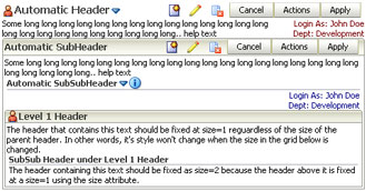
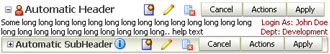
| <af:panelHeader> |
The Header Panel control places a label and optional icon at the top of a section. |
 |
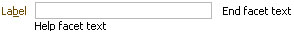
| <af:panelLabelAndMessage> |
This component lays out a label and children. |
 |
| <af:panelList> |
The panelList control outputs each visible child in a list with a bullet next to it. |
 |
| <af:panelSplitter> |
Use this to divide a region into two parts with a repositionable divider. |
 |
| <af:panelStretchLayout> |
The panelStretchLayout component stretches the child in the center facet to fill all of the available space. |
 |
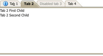
| <af:panelTabbed> |
The panelTabbed control creates, contains and shows a series of items defined by showDetailItem nodes. |
 |
| <af:panelWindow> |
A panel component that displays its children in a window. |
 |
| <af:poll> |
The poll component delivers PollEvents to the server at fixed intervals. For example, this can be used either for steady updates, to deliver a heartbeat to keep a user logged in, or to warn a user about to be logged out. |
No image |
| <af:popup> |
The popup component is an invisible control whose contents will be used in popup windows, such as context menus. |
 |
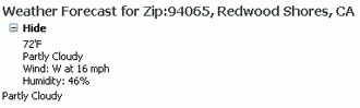
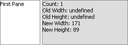
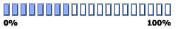
| <af:progressIndicator> |
The progressIndicator component can be used to give users an understanding that there is a back end task in progress. |
 |
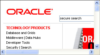
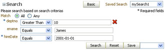
| <af:query> |
The Query control is used to display a complete search panel. |
 |
| <af:quickQuery> |
QuickQuery component is used to do a quick search. |
 |
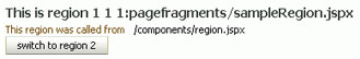
| <af:region> |
The region tag allows dynamic content to be included in a master page. |
 |
| <af:resetButton> |
The reset button control creates a push button which will reset the content of a form for all input and select components. |
 |
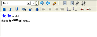
| <af:richTextEditor> |
The richTextEditor component creates an input widget for rich text formatting. It also supports displaying a label, text, and messages. |
 |
| <af:selectBooleanCheckbox> |
A component which allows the end user to select a checkbox. |
 |
| <af:selectBooleanRadio> |
A component which allows the end user to select a radio button in a group of radio buttons. |
 |
| <af:selectItem> |
The selectItem tag represents a single item that the user may select from a list, choice, radio, or shuttle ADF control. |
 |
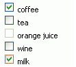
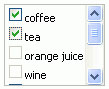
| <af:selectManyCheckbox> |
A component which allows the end user to select multiple valuesfrom a list of available options. |
 |
| <af:selectManyChoice> |
A menu-style component, which allows the user to select multiple values from a dropdown list of items. |
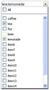 |
| <af:selectManyListbox> |
The selectManyListbox component creates a component which allows the user to select multiple values from a list of items. |
 |
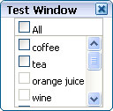
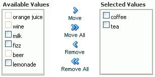
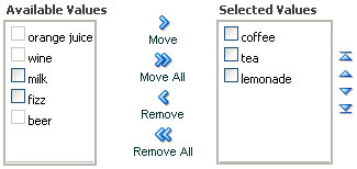
| <af:selectManyShuttle> |
The selectManyShuttle component provides a mechanism for selecting multiple values from a list of values by allowing the user to move items between two lists. |
 |
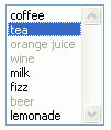
| <af:selectOneChoice> |
The selectOneChoice component creates a menu-style component, which allows the user to select a single value from a list of items. |
 |
| <af:selectOneListbox> |
The selectOneListbox component creates a component which allows the user to select a single value from a list of items. |
 |
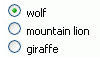
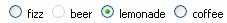
| <af:selectOneRadio> |
A component which allows the end user to select a single value from a list of available options. |
 |
| <af:selectOrderShuttle> |
The selectOrderShuttle component provides a mechanism for selecting multiple values from a list of values by allowing the user to move items between two lists, and reordering that list of values. |
 |
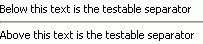
| <af:separator> |
The seperator is used anywhere to create a horizontal separator between items. |
 |
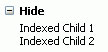
| <af:showDetail> |
The showDetail provides a means of toggling a group of components between being hidden or shown. |
 |
| <af:showDetailHeader> |
The showDetailHeader provides a means of toggling the contents under a header between being disclosed(shown) or undisclosed(hidden). |
 |
| <af:showDetailItem> |
The showDetailItem represents a single item with specific contents that can be selected by users to be shown in a showOne component. |
 |
| <af:spacer> |
Used anywhere to add spacing between items. |
 |
| <af:statusIndicator> |
The statusIndicator displays an animated icon to indicate server activity. While a server request is active, the status icon is displayed, otherwise the idle icon is displayed. |
 |
| <af:subform> |
The subform tag represents an independently submittable region of a page. The contents of a subform will only be validated (or otherwise processed) if a component inside of the subform is responsible for submitting the page. |
No image |
| <af:switcher> |
The switcher component dynamically decides which facet component should be rendered. |
No image |
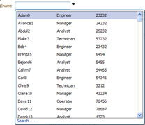
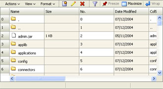
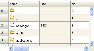
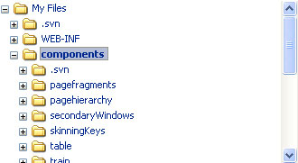
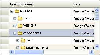
| <af:table> |
The Table is used to display tabular data. It also supports selection (both single and multiple), sorting, and record navigation. |
 |
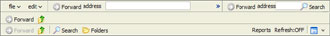
| <af:toolbar> |
A toolbar that usually contains commandToolbarButtons. |
 |
| <af:toolbox> |
A container for Toolbars and MenuBars, with built-in functionality like overflow. |
 |
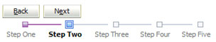
| <af:train> |
The train component indicates the location of the current page within a multi-step process. Each step is represented as a train stop. |
 |
| <af:trainButtonBar> |
The trainButtonBar component is a collection of buttons that allows an additional means to navigate the stops in a train. This component can be used in conjunction with the train component to provide multiple ways to navigate through train stops. |
 |
| <af:tree> |
Represents an interactive tree component. |
 |
| <af:treeTable> |
Represents an interactive hierarchical table component. |
 |
| Name |
Description |
| <af:attributeDragSource> |
The attributeDragSource tag is a declarative way of making a component a source of a drag using one of its attributes as the drag payload. |
| <af:attributeDropTarget> |
The attributeDropTarget tag is a declarative of enabling the setting of a component's attribute by drag and drop. |
| <af:calendarDropTarget> |
This tag makes calendar component a drop target and can be used to declaratively initialize the drop target. |
| <af:clientAttribute> |
The clientAttribute tag specifies the name/value for an attribute which will both be made available both on the server-side (Faces) component as well on on the client-side equivalent. |
| <af:clientListener> |
The clientListener tag is a declarative way to register a client-side listener script to be executed when a specific event type is fired. |
| <af:collectionDragSource> |
This tag makes a collection component(for e.g. table, treeTable or tree) a drag source and can be used to declaratively initialize the drag source. |
|
| <af:collectionDropTarget> |
This tag makes a collection component(for e.g. table, treeTable or tree) a drop target and can be used to declaratively initialize the drop target. |
| <af:componentDef> |
Defines a declarative component. |
| <af:componentDragSource> |
The componentDragSource tag makes the enclosing component draggable. |
| <af:dataFlavor> |
Adds a DataFlavor to the DataFlavors consumed by a drop target |
| <af:dropTarget> |
Makes a component eligible to accept drops during drag and drop. |
| <af:exportCollectionActionListener> |
The exportCollectionActionListener is a declarative way to allow an action source (<commandButton>, <commandLink>, etc.) to export data from a collection component (table, tree or treeTable) into an external format |
| <af:facetRef> |
Used in a page template or declarative component definition to reference a facet that was defined in the page template or declarative component usage. This tag can only be used inside of pageTemplateDef or componendDef. |
| <af:fileDownloadActionListener> |
The fileDownloadActionListener tag is a declarative way to allow an action source (<commandButton>, <commandLink>, etc.) to programatically send the contents of a file to the user. |
| <af:forEach> |
The forEach tag is a replacement for the JSTL <forEach> tag that adds support for varStatus in JSF. |
| <af:pageTemplateDef> |
Defines a page template. |
| <af:insertTextBehavior> |
The insertTextBehavior tag is a declarative way to insert text into an inputText at the current selection. |
| <af:panelDashboardBehavior> |
The panelDashboardBehavior tag is a declarative way to allow an action source (<commandButton>, <commandLink>, etc.) to apply visual changes to a panelDashboard component. |
| <af:resetActionListener> |
The resetActionListener tag is a declarative way to allow an action source (<commandButton>, <commandLink>, etc.) to fire a reset action. |
| <af:resource> |
The resource tag is a way to include CSS and JavaScript in the document head from outside the <af:document/> metaContainer facet |
| <af:returnActionListener> |
The returnActionListener tag is a declarative way to allow an action source (<commandButton>, <commandLink>, etc.) to return a value from a dialog or process. |
| <af:richTextEditorInsertBehavior> |
The richTextEditorInsertBehavior tag is a declarative way to insert an XHTML fragment into a richTextEditor at the current selection. |
| <af:scrollComponentIntoViewBehavior> |
The scrollComponentIntoViewBehavior tag is a declarative way to scroll a component into view and optionally set focus in it. |
| <af:serverListener> |
The serverListener tag is a declarative way to register a Java listener method to be executed when a custom client event is fired. |
| <af:setActionListener> |
The setActionListener tag is a declarative way to allow an action source (<commandButton>, <commandLink>, etc.) to set a value before navigation. |
| <af:setPropertyListener> |
The setPropertyListener tag is a declarative way to set a value in an event listener. |
| <af:skipLinkTarget> |
The skipLinkTarget tag makes it easy to provide end users with a way to skip over repetitive navigation content at the top of the page. |
| <af:showPopupBehavior> |
The showPopupBehavior tag is a declarative way to show a popup component in response to a client-side action event or other events (like right-click menus). |
| <af:showPrintablePageBehavior> |
The showPrintablePageBehavior tag is the way to show a printable version of a page, by attaching the behavior to a command component. |
| <af:xmlContent> |
Allows arbitrary xml content to be included in a jsp page. This tag should be used inside of a pageTemplateDef or a componentDef to describe the attributes, facets, and overall description of the page template or declarative component. |