10g (9.0.4) for Windows
Part Number B10272-01
Home |
Contents |
Index |
| Oracle Discoverer Desktop User's Guide 10g (9.0.4) for Windows Part Number B10272-01 |
|
Discoverer Desktop can convert tables and crosstabs to graphs or charts so you can analyze and present data graphically. Graphs and charts of tables and crosstabs are especially effective for presentations of results. This chapter explains how display data on a graph.
The topics covered in this chapter include:
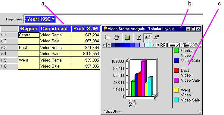
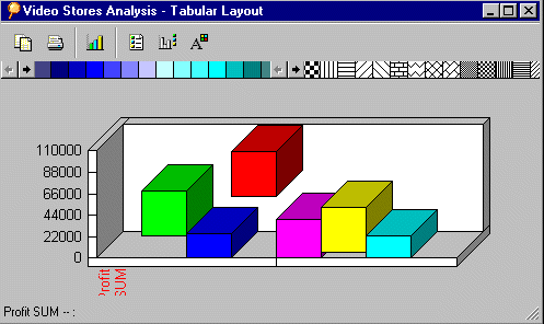
The following figure shows a table and its resulting graph. This sample shows a bar graph, but several other styles are also available.
To display Worksheet data as a graph:
The first time you display a graph, the Graph Wizard walks you through the process of defining the graph's features. Then, a graphical representation of the worksheet appears in the Graph window.
The graph retains its design features when closed. The next time you open it, the graph has the same appearance.
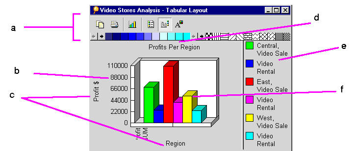
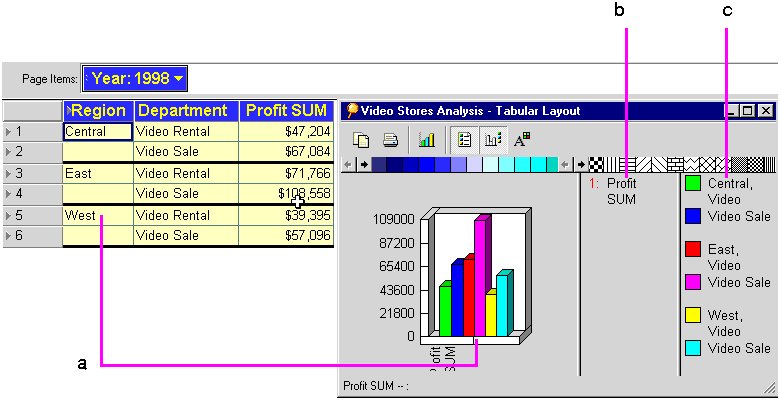
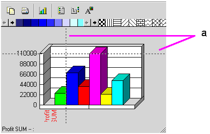
Figure 3-2 shows the features on a typical graph.
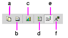
To work with the graph, use the Graph menu on the worksheet window or the Graph tool bar on the Graph window. To show or hide the Graph tool bar, choose Graph | Toolbar. The following figure identifies the icons on the Graph tool bar.
Note: You can also show or hide the status bar in the Graph window. Choose Graph | Status Bar.
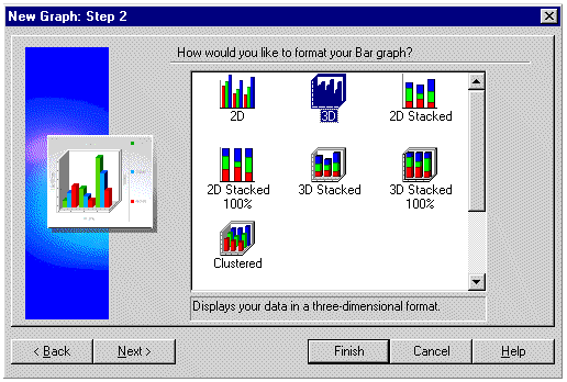
The Graph Wizard walks you through the process of creating a graph. These dialog boxes only appear the first time you create a graph of a table or crosstab. To make any changes to a graph later, use the Modify Graph button on the Graph tool bar.
To create the initial graph with the Graph Wizard:
The first Graph Wizard dialog box appears:
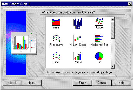
To expand the text description at the bottom of the box, put the pointer on the text.
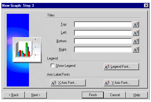
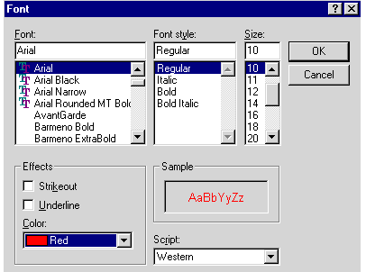
Select the font choices and click OK. Repeat for the other design elements that you want to format individually.
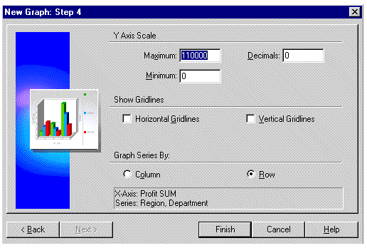
Y-Axis Scale - enter numbers in the Minimum and Maximum boxes to set the upper and lower boundaries of the y-axis; usually the Minimum value is zero. The Maximum value is normally a value higher than the maximum data point value.
Decimals - enter a number for the number of decimal places on the y-axis scale; enter 2, for example, to display the scale numbers as 100.00.
Show Gridlines--click each option to show gridlines on the background of the graph.
Graph Series By--select one or the other option:
You do not have to update a graph manually. As you analyze data on tables and crosstabs, additional data displayed as part of the analysis is automatically added to the graph and appears the next time you display the graph.
For example, if you display a column of percentages for the data, that column's data becomes data points on the graph. Likewise if you pivot a column to the page axis, the graph is automatically updated to reflect that change.
To modify a graph:
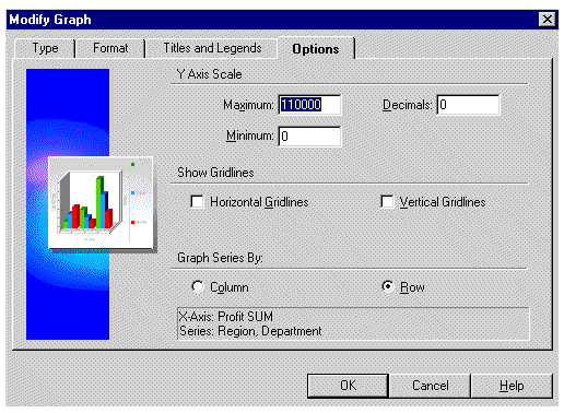
The tabs across the top of the dialog box offer the same features as the Graph Wizard dialog boxes that you initially used to create the graph.
Here the Options tab is selected. Compare the options shown in the figure above with Figure 3-9 on page 3-8. You can see that the two provide the same options.
In addition to modifying the y-axis scale with the Modify Graph dialog box shown above, you can also choose Graph | Scale. The dialog box that appears includes additional options to set the y-axis scale units, plot the scale linearly or logarithmically, and to set the size of the gap between plotted data points.
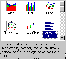
To select a new graph type:
The dialog box for a new graph type appears.
If you do not want to change the graph's current type, click on the Graph window (off the drop-down list) and the list closes.
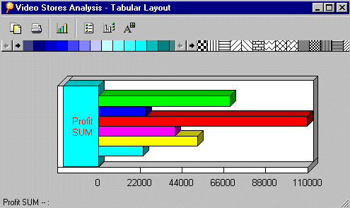
Here are samples of two types of graph that plot the same data.
You can show or hide the legend and X labels by clicking the buttons on the tool bar.
To display the legend and X labels:
Note: These buttons and commands are toggles--that is, click a button to show the data; click it again to hide the data.
Here is a sample graph showing both the legend and X labels from the rows on the original table or crosstab.
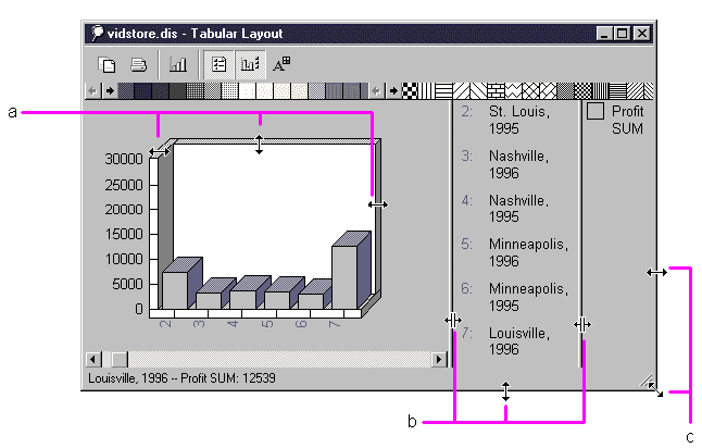
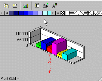
You may need to resize the graph or its window depending on the type of graph and the amount of plotted data. You can resize most portions of the window and graph.
To select the window or graph so you can resize it:
The following figure shows some of the places you can drag the pointer to resize.
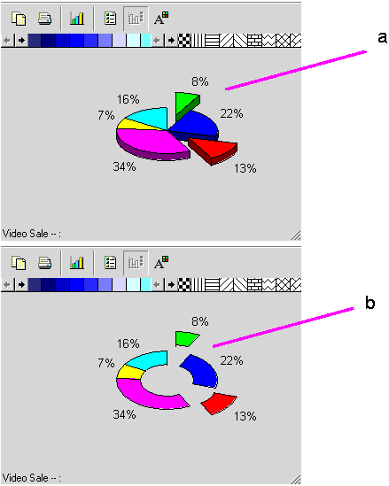
On most of the graph types, dragging on the graph produces a set of reference lines that you can use to visually correlate the graph's data points with the vertical and horizontal scales. On the pie graph and donut graph types, however, dragging pulls sections of the graph out so you can call special attention to them.
Here are some examples:
You can rotate 3D graphs to view them from a different perspective.
To rotate a graph:
A dialog box for rotating the graph appears.
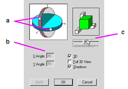
Hint: Before you begin to rotate a graph, write down the X Angle and Y Angle numbers and note the position of the slider so you can return the graph to its unrotated position after experimenting with rotation.
As you drag the dots, the reference figure represents the amount of rotational change to the graph. The X Angle and Y Angle numbers also change as you drag the dots.
Hint: You can also enter numbers for the X Angle and Y Angle in the respective boxes. Entering numbers instead of dragging the dots is often a good way to get the exact rotation for a series of graphs.
Dragging the slider increases or decreases the amount of depth to the graph.
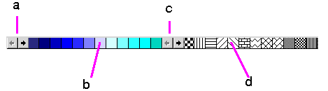
The tool bar on the Graph window includes a set of colors and patterns for changing the colors and adding patterns to the graph.
To change a color or pattern:
The pointer becomes a paint jar.
You can recolor the plotted data, the axes, the legend background, and the graph's background.
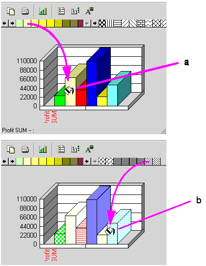
If you apply a pattern to a graph that has a color, the black bits of the pattern become the color. A graph can be patterned or solid colors, but not both.
If you want a colored pattern, first drag a color down to the graph, then drag a pattern down to the graph.
To remove a pattern from the graph:
To create a custom pattern:
The Pattern Editor appears.
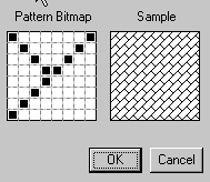
The new pattern replaces the original one you started with on the tool bar.
To create a custom color:
The Color dialog box appears.
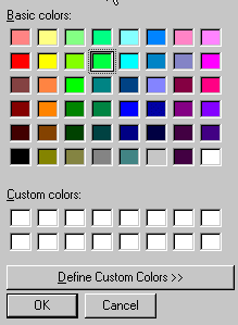
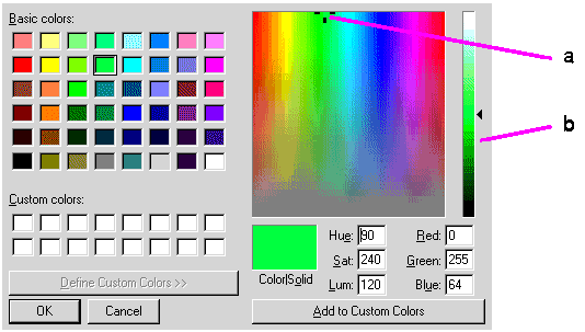
The dialog box expands to show the tools for defining a custom color.
To edit one of the custom colors already in the panel, click on it instead.
As you drag the Reference Marker, the Color|Solid box shows the new color. Color refers a dithered color if your computer is set to show dithered colors. Solid refers to the nearest solid (undithered) color. Note that luminance remains constant as you drag the marker.
You can also type the color numbers directly in their boxes.
The new color replaces the original one you started with on the tool bar.
|
|
 Copyright © 1996, 2003 Oracle Corporation. All Rights Reserved. |
|